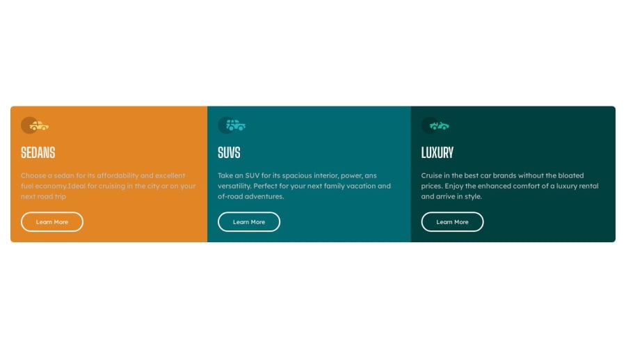
3 Column Preview Card (Mobil First + Bem)
Design comparison
Solution retrospective
While creating this project, I started mobile first and used Bem. I am open to suggestions.
Community feedback
- @HassiaiPosted over 1 year ago
Every html must have <h1> to make it accessible. Always begin the heading of the html with <h1> tag wrap the sub-heading of <h1> in <h2> tag, wrap the sub-heading of <h2> in <h3> this continues until <h6>, never skip a level of a heading.
To center .cars on the page using flexbox or grid instead of giving .cars a margin values:
- USING FLEXBOX: add min-height:100vh; display: flex; align-items: center: justify-content: center; to the body
body{ min-height: 100vh; display: flex; align-items: center; justify-content: center; }- USING GRID: add min-height:100vh; display: grid place-items: center to the body
body{
min-height: 100vh;
display: grid;
place-items: center;
}
Give .cars a fixed max-width value.
max-width: 600px.Give the body a background-color. Use the colors that were given in the styleguide.md found in the zip folder you downloaded.
Give the button a background-color of transparent, a font-color that is is the same as the background-color of the car, increase the font-weight of the button. . the styling you gave to the button is the hover effect design.
Use relative units like rem or em as unit for the padding, margin, width values and preferably rem for the font-size values, instead of using px which is an absolute unit. For more on CSS units Click here and here
Hope am helpful.
Well done for completing this challenge. HAPPY CODING
Marked as helpful0
Please log in to post a comment
Log in with GitHubJoin our Discord community
Join thousands of Frontend Mentor community members taking the challenges, sharing resources, helping each other, and chatting about all things front-end!
Join our Discord
