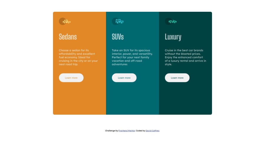
Design comparison
SolutionDesign
Solution retrospective
Looks okay to my eye. What do you think?
Community feedback
- @alex931dPosted over 1 year ago
hello great outcome i love it very much i still have some suggestions
on larger devices the design is very big you should put an max heigth on the card
Marked as helpful0 - @Mohammedabbas7Posted over 1 year ago
Congratulation on completing this challenge, well done 🎉🎉🎉. I have a few suggestions for you:
- instead of using the main element to center the card you could create div with class of container inside the main to center the card, and inside the container create another div with the class of card to hold the column like this:
HTML
<main>
    <div class="container">
       <div class="card">
       </div>
    </div>
</main>
CSS
.container { display: flex; align-item: center; justify-content: center; min-height: 100vh; }- I noticed that you gave the .car-type class height property. it's better to let the content define the height of its parent instead of give in it a specific height.
I hope what I gave you is helpful.
Happy coding :)
0@DavidCaffreyPosted over 1 year agoThank you for the advice. I will make the adjustments you suggest.😁@Mohammedabbas7
0
Please log in to post a comment
Log in with GitHubJoin our Discord community
Join thousands of Frontend Mentor community members taking the challenges, sharing resources, helping each other, and chatting about all things front-end!
Join our Discord
