Submitted over 1 year agoA solution to the 3-column preview card component challenge
3-Column Preview Card

@tmen670
Solution retrospective
What challenges did you encounter, and how did you overcome them?
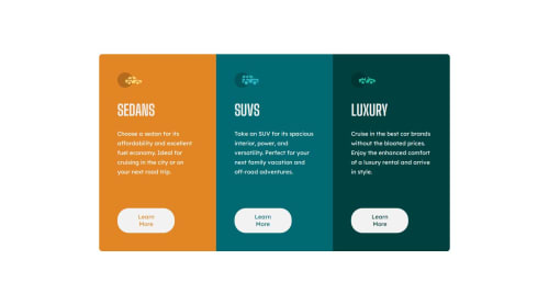
The biggest challenge I faced was trying to make the website responsive. As I shrank the viewport's width, the buttons on the button kept misaligning. I initially used margins below each content but as I shrank the viewport, the paragraph gets longer, thus furthering the margin which pushes the button, causing misalignment. I fixed this using flexbox instead of margins and setting each flex item to a specific height. Now the buttons stay aligned when adjusting viewports.
Code
Loading...
Please log in to post a comment
Log in with GitHubCommunity feedback
No feedback yet. Be the first to give feedback on TM3N's solution.
Join our Discord community
Join thousands of Frontend Mentor community members taking the challenges, sharing resources, helping each other, and chatting about all things front-end!
Join our Discord