

Design comparison
SolutionDesign

Solution retrospective
Hi
Community feedback
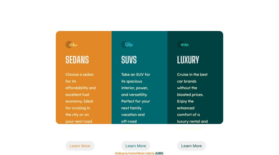
- @prmerguPosted about 1 year ago
my suggestion for your media query, as the learn more buttons are coming out of the box.
@media screen and (min-width: 1440px) main { position: absolute; top: 50%; left: 50%; transform: translate(-50%, -50%); width: 20%; height: 60%; display: flex; flex-direction: column; flex-wrap: wrap; }
0@JOJOK63Posted about 1 year ago@prmergu thank i will try.but i don't know why on the sceen my button is down because on my page i didn't see that
0@prmerguPosted about 1 year agoyes bro responsive always gives some problem, on my pc adjusting top and left was perfect too, I don't know if adding a display block might work
0

Please log in to post a comment
Log in with GitHub
Join our Discord community
Join thousands of Frontend Mentor community members taking the challenges, sharing resources, helping each other, and chatting about all things front-end!
Join our Discord