Design comparison
Solution retrospective
Hi all,
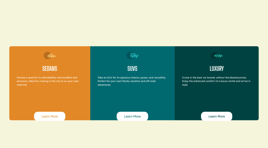
I had a few issues with this one. For some reason I could not figure out how to make the columns contain all my information as they are resized.
I need some advice on if I am displaying things correctly. How I should position these thing within the divs to make them stay in position and how to maintain the aspect ratio of the entire card while the browser is being resized.
Anyone that takes the time to look at and respond, thank you very much, I am extremly gratefull.
Angus
Community feedback
- @CodeLamp168Posted about 2 years ago
Container does not have a width given that's why the text is moving. However it does not center if you do.
A tip: When you are making similar designs for each card, give them all the same class name. You can implement more than just one class to each. For class "item1" "item2" "item3". Instead write: "card item1" "card item2" "card item3" Now card and item are seperate classes for the element and can be good for organizing in css.
So I use the class "card" for setting the width, height, and the padding for each card. You can set height to auto/height:auto and work through using margins for the text or just set a determined height. Usually recommend height:auto Then I use "item1" to design that specific card's color and image.
Don't text-align:center on body. I usually do it on specific areas. But you can set the font-size and font-family there. check the style-guide thats given.
Also its good practice to start designing by mobile first so that it can be responsive. Simply remove the display:flex on container and you have atleast a template for what the mobile design would be like. Then use ex: @media (min-width: 50em) { .container { display:flex; } for the desktop version. }
This means when the screen hits 800px, the container will become display:flex. (You wont need to repeat any code just need to position the elements to row)
You can look at my solution's html and css. However there are simpler solutions on github and they really do help make you understand the structure if you go through them.
Marked as helpful0@echoturnbullPosted about 2 years ago@CodeLamp168 Thanks so much for the feedback! I sat and stared at this for ages trying to figure it out.
I will have to look at the @media and get used to using it. I have not included it any of the projects I have done yet.
Cheers!!
0
Please log in to post a comment
Log in with GitHubJoin our Discord community
Join thousands of Frontend Mentor community members taking the challenges, sharing resources, helping each other, and chatting about all things front-end!
Join our Discord