3 Column Preview Card _ Front End Mentor Challenge
Design comparison
Solution retrospective
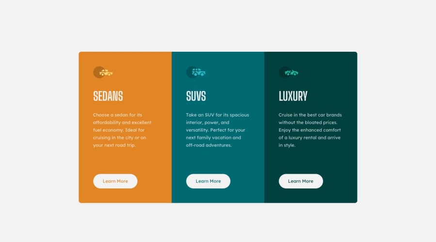
Second project down - scratched my head at first with regards to the positioning of "button" as it is not inline with the other elements within the box. Happy to hear suggestions on what could be better on my code. Working on lots more. :)
Community feedback
- P@jacksen30Posted over 1 year ago
Feedback on Your Solution
Firstly, congratulations on getting your design to visually match the requirements the live site looks great.
Here's a few quick and easy to implement code fixes / improvements
Semantic HTML Improvements:
Main Tag: For enhanced semantic clarity, consider enclosing the primary content (typically everything outside of the header and footer) within the
<main></main>tags.Header Consistency: Aim for a single
<h1>tag per page to maintain hierarchical clarity and improve SEO.Refactored CSS Recommendations:
Consolidate Common Styles: Rather than applying individual CSS rules to each of the
.sedans,.suvs, and.luxuryclasses, it's more efficient to group and apply shared styles collectively. For example:.sedans, .suvs, .luxury { display: flex; flex-direction: column; justify-content: center; align-items: center; margin: 30px 0; width: 250px; }Unified Button Hover Styles: I added a extra class
btnto all the buttons elements in your HTML. By consolidating hover styles into a singular rule and using thebackground-color: inheritproperty, you can minimize redundancy and ensure consistent behavior. Notably, this adjustment will correct the color inconsistency present in.button-2:hover..btn:hover { background-color: inherit; color: white; border: 2px solid white; }Optimized Border Radius Syntax: Utilize the shorthand
border-radiusproperty to simultaneously set values for all four corners, promoting cleaner and more concise code..sedans { border-radius: 7px 7px 0 0; }Here is all the updates I've made - more could be done but I think if you just compare it to the original and research the changes made from the original it'll greatly improve your future challenge solutions, I hope this helps you a lot
* {
    padding: 0;
    margin: 0;
}

body {
    background-color: white;
}

.wrapper {
    display: flex;
    justify-content: center;
    align-items: center;
    height: 100vh;
}

h1 {
    font-family: 'Big Shoulders Display', cursive;
    color: hsl(0, 0%, 95%);
    align-self: first baseline;
    margin-left: 35px;
    margin-top: 30px;
}

p {
    font-family: 'Lexend Deca', sans-serif;
    font-size: 15px;
    color: hsla(0, 0%, 100%, 0.75);
    margin: 35px;
    padding-bottom: 20px;
}

.sedans,
.suvs,
.luxury {
    display: flex;
    flex-direction: column;
    justify-content: center;
    align-items: center;
    margin: 30px 0px 0px 0px;
    width: 250px;
}

.sedans {
    background-color: hsl(31, 77%, 52%);
    border-radius: 6px 0 0 6px;
}

.suvs {
    background-color: hsl(184, 100%, 22%);
}

.luxury {
    background-color: hsl(179, 100%, 13%);
    border-radius: 0 6px 6px 0
}

button {
    width: 150px;
    height: 40px;
    border-radius: 19px;
    border-style: none;
    font-family: 'Lexend Deca', sans-serif;
    color: black;
    align-self: baseline;
    margin-top: 20px;
    margin-bottom: 40px;
    cursor: pointer;
}

.button-1 {
    color:hsl(31, 77%, 52%);
}

.button-2 {
    color: hsl(184, 100%, 22%);
}

.button-3 {
    color: hsl(179, 100%, 13%);
}

.btn:hover {
    background-color:inherit;
    color: white;
    border: 2px solid white;
    border-color: white ;
}

.sedan-icon, .suv-icon, .luxury-icon {
    display: block;
    align-self: first baseline;
    margin-top: 40px;
    margin-left: 25px;
}

@media only screen and (max-width:750px) {


    .wrapper {
        display: flex;
        flex-direction: column;
        height: 100%;
    }

    .sedans, .suvs, .luxury {
        height: 60vh;
        padding: 5px;
        margin-bottom: -30px;
        padding-bottom: 10px;
    }

    .sedans {
        border-radius: 7px 7px 0 0;
    }

    .luxury {
        border-radius: 0 0 7px 7px;
    }
}
Keep completing challenges and receiving feedback and you'll be amazed at how much you will learn in a short time. I'm looking forward to seeing many more projects from you in the future. Happy Coding !
Marked as helpful0 - @mk-muzzammilPosted over 1 year ago
yeah I have found your mistake u are lets talk about one section .In first section sedan section u are trying to use flex properties without using display flex and it effects your positioning of button because you can use align-self :baseline only when your parent element which is your section in this case should be flex but in this case parent element is display block due to which you will not position your button . Do these Changes to correct it : .sedans{display:flex;flex-firection:column;} .button:remove display block and margin-left:20px and use align-self:baseline instead of align-self:first baseline. Hope so this comment will help you in understanding your issue.
Marked as helpful0 - @JessicaSamtaniPosted over 1 year ago
Really appreciate your feedback. Will work on it
0
Please log in to post a comment
Log in with GitHubJoin our Discord community
Join thousands of Frontend Mentor community members taking the challenges, sharing resources, helping each other, and chatting about all things front-end!
Join our Discord
