Not Found
Not Found
Not Found
Not Found
Not Found
Not Found
Not Found
Not Found
Not Found
Not Found
Not Found
Not Found
Not Found
Not Found
Not Found
Not Found
Not Found
Not Found
Not Found
Not Found

Submitted

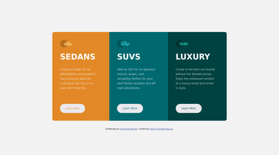
3 Column Preview Card Design (Responsive)

@Girishbanua

Desktop design screenshot for the 3-column preview card component coding challenge

This is a solution for...

  • HTML
  • CSS
1newbie
View challenge

Design comparison


SolutionDesign

Community feedback

Lucas πŸ‘Ύβ€’ 104,440

@correlucas

Posted

πŸ‘ΎHello Girish, Congratulations on completing this challenge!

Great code and great solution! I’ve few suggestions for you that you can consider adding to your code:

  • The icon doesn’t have an important role when you think about semantics and the html structure. So you can add aria-hidden=β€œtrue” to avoid it being found and read in the accessibility mode/screen readers. These are only decorative items.
  • Use max-width: 100% for the cards in the mobile version to allow the cards grow 100% of the width considering the paddings and avoid to have a lateral gap (limited by a fixed width).
  • To make your CSS code easier to work you can create a single class to manage the content that is mostly the same for the 3 cards (paddings, colors, margins and etc) and another class to manage the characteristics that are different (colors and icon), this way you'll have more control over then and if you need to change something you modify only one class.
  • Think about using relative units as rem or em instead of px to improve your performance by resizing fonts between different screens and devices. Anyhow, if we want a more accessible website, then we should use rem instead of px. REM does not just apply to font size, but to all sizes as well.

✌️ I hope this helps you and happy coding!

Marked as helpful

0

@VCarames

Posted

Hey @Girishbanua, some suggestions to improve you code:

  • Implement a Mobile First approach πŸ“± > πŸ–₯

With mobile devices being the predominant way that people view websites/content. It is more crucial than ever to ensure that your website/content looks presentable on all mobile devices. To achieve this, you start building your website/content for smaller screen first and then adjust your content for larger screens.

  • To center you content to your page, add the following to your Body Element:
body {
    min-height: 100vh;
    display: grid;
    place-content: center ;
}
  • Your "buttons" were created with the incorrect element. When the user clicks on the button they should directed to a different part of you site. The Anchor Tag will achieve this.

Happy Coding! πŸ‘»πŸŽƒ

Marked as helpful

0

Please log in to post a comment

Log in with GitHub
Discord logo

Join our Discord community

Join thousands of Frontend Mentor community members taking the challenges, sharing resources, helping each other, and chatting about all things front-end!

Join our Discord