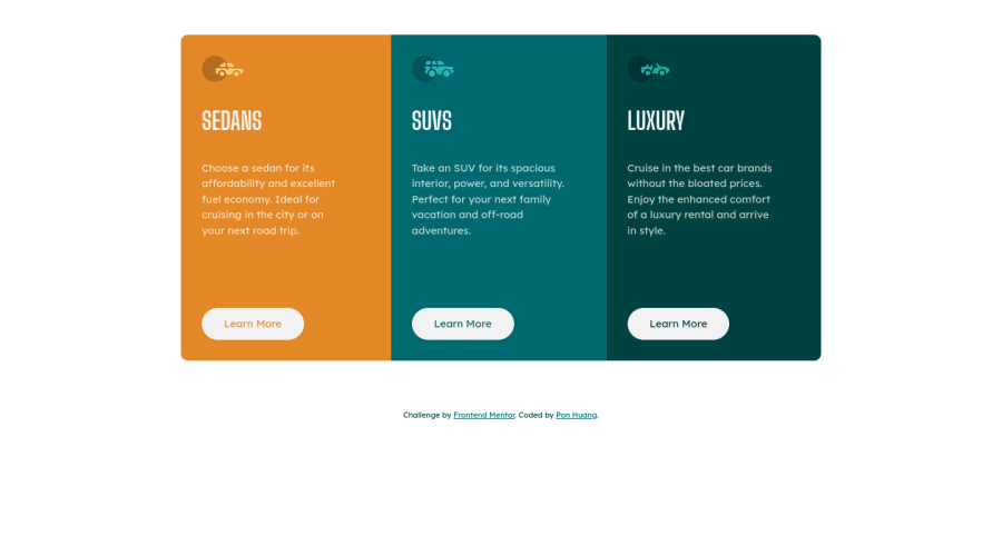
Design comparison
Solution retrospective
Does anyone know why the button text didn't just take its space as it need?
I did set the display to inline-block, but when I inspect them in Chrome dev, still can see the text is not working as inline-block. No idea why it happens like this, or is there anything I missed or made mistake?
Thanks 🙏🏻
Community feedback
- @pradeeps4iniPosted almost 3 years ago
Hi, Pon Huang. How are you?
Your button width is not what you want because it is inheriting width from the parent element. You should change the button width to a value you want. In the design of the project, buttons width seems to be around 140px or 150px.
0@ponhuangPosted almost 3 years ago@pradeeps4ini Thank you, no sure it inherits which parent's setting, maybe the flex property. Now I set the width to 140px, thanks for helping :)
0@Yasmine10Posted almost 3 years ago@ponhuang The reason the button was full width is because flexbox stretches the width of the button. You can also do the following for better responsiveness of the button, that way when the text of the button changes it will still look good.
width: fit-content; padding: 1rem 2rem;0@pradeeps4iniPosted almost 3 years ago@Yasmine10 You're right. fit-content is much better. It would make the button responsive, where as 150px will be a fixed size.
0@ponhuangPosted almost 3 years ago@Yasmine10 Thanks so so much, this is amazing! It works perfectly. 💛
0 - @mv805Posted almost 3 years ago
You should be using a <button> element for all buttons, not <a>, <div> or anything else simulating button functionality. Then the text will be nice and centered by default.
0@ponhuangPosted almost 3 years ago@mv805 I tried using <button> but it didn't work properly as well :(
0
Please log in to post a comment
Log in with GitHubJoin our Discord community
Join thousands of Frontend Mentor community members taking the challenges, sharing resources, helping each other, and chatting about all things front-end!
Join our Discord
