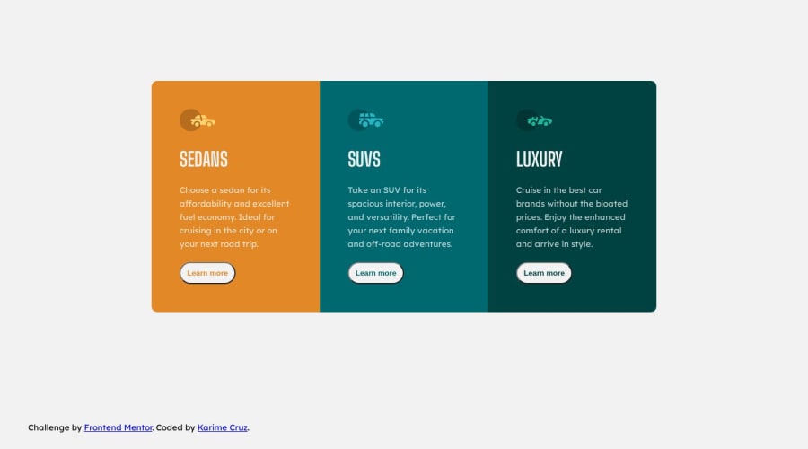
Design comparison
Solution retrospective
This was an interesting chllenge.
Community feedback
- @Islandstone89Posted 10 months ago
HTML:
-
Every webpage needs a
<main>that wraps all of the content, except for<header>andfooter>. This is vital for accessibility, as it helps screen readers identify the "main" section of a page. Since the card container(<section>) is the only "main" content here, you can replace it (change<section>to a<main>) OR add the<main>as a parent of the<section>. I would use a<div>instead of a<section>if you're using<main>as the parent of the card container. -
There should only be one
<h1>on a page. Given there are 3 similar headings, I would change all of them into a<h2>. -
The headings should be written with normal capitalization. You then use
text-transform: uppercaseto change the capitalization in CSS. -
"Learn More" would navigate to another page, hence it is not a button but a link.
CSS:
-
It's good practice to include a CSS Reset at the top.
-
You should only set one
font-familyon thebody. -
font-sizemust never be in px. This is bad for accessibility, as it prevents the font size from scaling with the user's default setting in the browser. Use rem instead. -
Remove
widthandmarginon the card container. Add amax-widthin rem if needed, so it doesn't get too wide on big screens. To center it horizontally and vertically, use Flexbox on the body:
display: flex; flex-direction: column; justify-content: center; align-items: center; min-height: 100vh;-
Set
display: flexandflex-direction: columnon the card container. Change it toflex-direction: rowon larger screens. -
Media queries should be in rem instead of
px. It should also switch a bit sooner - try around50rem(equals800px).
Marked as helpful0 -
Please log in to post a comment
Log in with GitHubJoin our Discord community
Join thousands of Frontend Mentor community members taking the challenges, sharing resources, helping each other, and chatting about all things front-end!
Join our Discord
