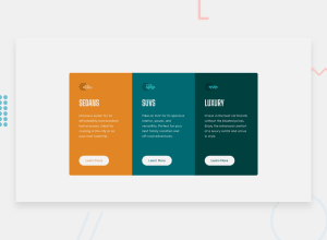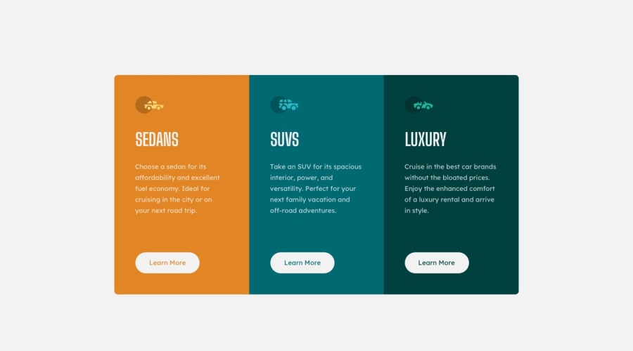
Design comparison
Solution retrospective
I did this challenge to try and get more comfortable with CSS grid. Any feedback is appreciated, and feedback about grid is particularly welcome.
Community feedback
- @brookewargnierPosted about 3 years ago
Hey JonMStevens!
Really great job using grids on this project. I love that everything smoothly transitions in sizing. I have two quick suggestions to help improve!
1.) I'd look into keeping the height proportional and also shrinking as the display shrinks. You could set up a few different break points to help with the transition between desktop, tablet, and mobile.
2.) This ties into the first tip! There are really great theories on balancing how many characters you keep per line and I think these get a little squished in that middle ground (tablet world). This link does a really great job at explaining the optimal characters per line of text so everything still reads nicely:
https://www.smashingmagazine.com/2014/09/balancing-line-length-font-size-responsive-web-design/
If you set up the different break points, you can also transition your text to get smaller gradually in order to avoid lines with only 13 characters when the optimal is 45-75.
Otherwise I think you have a really great little project here and I look forward to seeing what you do next!
Marked as helpful2 - @ramirishoPosted about 3 years ago
The background color of the buttons must be the same white as the title.
Marked as helpful1 - @efs0-cod3Posted about 3 years ago
Your code looks great you should check some things like border radius and their position and the position of the attribution Instead of div I would change it to footer. Otherwise is looking good minor things. Hope it helps.
Marked as helpful1
Please log in to post a comment
Log in with GitHubJoin our Discord community
Join thousands of Frontend Mentor community members taking the challenges, sharing resources, helping each other, and chatting about all things front-end!
Join our Discord
