Submitted about 3 years ago
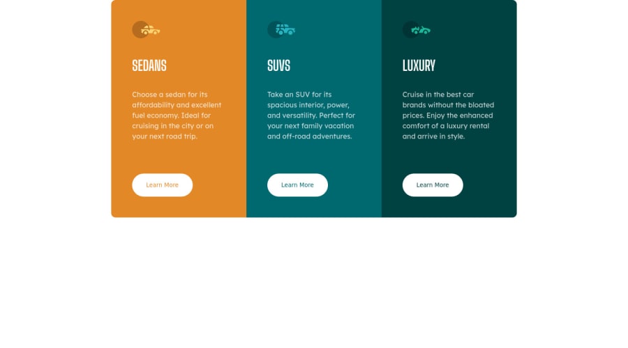
3 Column Preview Card Component with SCSS and React
#react#sass/scss
@NhanPhamTrong
Design comparison
SolutionDesign
Solution retrospective
This is the first time I use React in my solution. Any suggestion about how I organize things or others are appreciate. Thank you.
Community feedback
- @denieldenPosted about 3 years ago
Hi Nhan, great work on this challenge! 😉
Here are a few tips for improve your code:
- Tip of graphic design: with
font-family:" Big Shoulders Display ", cursivethe browser will use the Comics Sans font when it doesn't find the first font indicated (you can seen during loading)... for the designer it's a really awful font! I would rather replace it with afont-family:" Big Shoulders Display ", sans-serifmuch more similar to the primary font. - use flexbox to the body to center the card. Read here -> best flex guide
- after, add
min-height: 100vhto body because Flexbox aligns child items to the size of the parent container - add
transitionon the element with hover effect - instead of using
pxuse relative units of measurement likerem-> read here
Overall you did well 😁 Hope this help!
Marked as helpful1@NhanPhamTrongPosted about 3 years ago@denielden thanks very much! Your help always useful.
1 - Tip of graphic design: with
Please log in to post a comment
Log in with GitHubJoin our Discord community
Join thousands of Frontend Mentor community members taking the challenges, sharing resources, helping each other, and chatting about all things front-end!
Join our Discord
