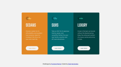
Submitted over 1 year agoA solution to the 3-column preview card component challenge
3 Column Preview Card Component with SASS
sass/scss
@xXOsielXx

Solution retrospective
What are you most proud of, and what would you do differently next time?
I'm proud to have used SASS for first time.
I'm proud to have used the clamp() function.
.preview-card-component > section
    width: clamp(308px, 80%, 440px)
I was stuck with the buttons, they were taking up the entire width. This happened because the buttons are children of a flex container with flex-direction: column, and apparently the default value of align-self is stretch. So I gave it a align-self: flex-start and it solved
I really appreciate any feedback you can give me
Code
Loading...
Please log in to post a comment
Log in with GitHubCommunity feedback
No feedback yet. Be the first to give feedback on Osiel Hernández's solution.
Join our Discord community
Join thousands of Frontend Mentor community members taking the challenges, sharing resources, helping each other, and chatting about all things front-end!
Join our Discord