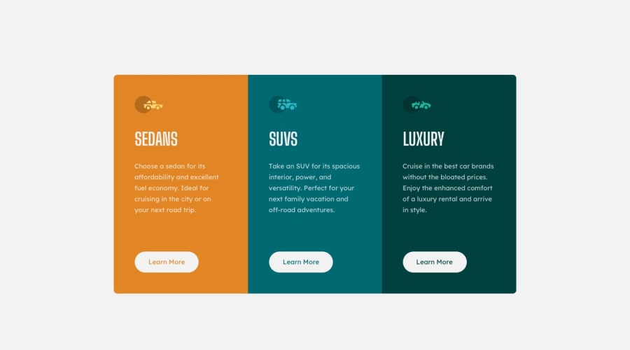
3 Column Preview Card Component with HTML + CSS
Design comparison
Community feedback
- @grace-snowPosted over 3 years ago
Hi sammy
This looks good. I have some suggestions for you
- try to add some headings in
- the learn more buttons should probably be anchor tags not button elements, as they would trigger navigation
- in your css you don't need two media queries. Base styles should be either mobile or larger screen, then you override only what you need to in a media query. Eg your container is set to width 60% as the base, but this is never used as you've overridden it in a max width (targeting mobile) and a min width (targeting larger than mobile) media query
I hope this makes sense and is helpful to you
1@sammyhawkradPosted over 3 years agoThanks for your feedback. I thought of adding headings but I just ignored the idea. The anchor suggestion is a good one, I think I nest the anchor tags around the button. The second media query takes care of medium sized screens between 601px and 1000px, larger screens use the base rules. The medium size screen wasn't part of the challenge but I see it's good to take care of that too.
0@grace-snowPosted over 3 years ago@sammyhawkrad it doesn't work like that unless you also add a max width condition to the second media query. Min width media queries are saying do this at all screen sizes above this size.
You don't need it though. Just add a max-width to your component instead of using widths in percentages.
At the moment some of the selectors are being applied In both media queries too (unnecessary duplication)
0@grace-snowPosted over 3 years agoOh and what do you mean by "nest the anchor tags around the buttons"? They are distinct elements for different purposes so can't be nested inside each other. Not sure I've understood what you mean
0@sammyhawkradPosted over 3 years ago@grace-snow This is how my media queries are working:
1.(max-width: 600px) - takes care of smaller screens
-
(min-width: 601x) and (max-width: 1000px) - takes care of medium sized screens between 601px and 1000px.
-
Base takes care of screens larger than 1000px
I don't see any duplication in here
0@sammyhawkradPosted over 3 years ago@grace-snow "nest the anchor tags around the buttons" means putting the button inside of an anchor tag. E.g "< a href="#" >< button >Learn More< /button >< /a >"
Edit: I've added spaces because it was being parsed as html and only the "Learn More" was showing
0@grace-snowPosted over 3 years agoI mean you don't need to have both. Ed container width is defined exactly the same in two media queries. If you are going desktop first, your larger media query should come first in the file and have no min-width on it at all. Then your smaller screen sizes below that. Order matters. The css cascade will handle things for you. So you wouldn't need to duplicate width and padding in multiple media queries.
If styling desktop first, or mobile first it's usual to only go in one direction min- or max- media queries.
This all demonstrates why its much more efficient in css to work mobile first. Less overrides, less duplication. As what applies on mobile will often apply to all screen sizes (usually simple one column layouts). It's also better to work mobile first as it takes less time for the browser to process (if on a mobile device on a big site, you don't want to have to process all the desktop styles before reaching the mobile styles)
1@grace-snowPosted over 3 years agoYou can't nest buttons and anchors inside each other, that's not valid html I'm afraid. They have totally separate meanings
0
Please log in to post a comment
Log in with GitHubJoin our Discord community
Join thousands of Frontend Mentor community members taking the challenges, sharing resources, helping each other, and chatting about all things front-end!
Join our Discord
