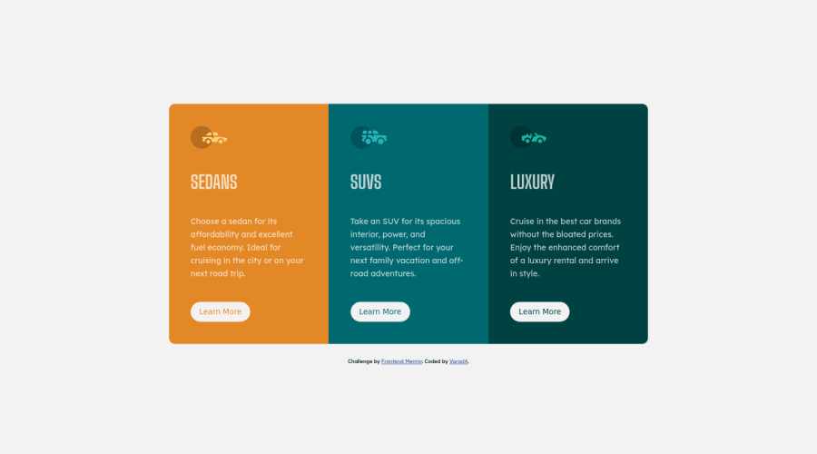
Design comparison
Solution retrospective
I tried to be as close to the design as possible.
I used a grid to have 3 cards of the exact same size, I couldn't do it with flexboxes, do you know if it's possible?
Feedback is welcome :)
Community feedback
- @vanzasetiaPosted almost 3 years ago
Greetings, Cédric! 👋
I notice that you are using Parcel and all your files that actually are used to show the site are located in the
docs/folder. For me, I thought when I opened thedocs/folder, it would contain the documentation of the project. 😅I think it would be better if you change the name to something like
dist/because it's the folder name is commonly named as it is or in yourREADMEfile provide a guideline to everyone that tells where the actual or the compiled files located. That way, it helps everyone that doesn't know anything about Parcel can still give feedback on your code. 👍Anyway, congratulations on finishing this challenge! 🎉
I have some feedback on this solution:
- Accessibility
- Well done on wrapping all page content with the correct landmarks! 👍
- Every page should only contain one
h1. I would recommend making all the currenth1toh2and adding a visually hiddenh1(*commonly known assr-onlystyling). - Commonly the Learn More buttons are link elements, however always specify the
typeof thebutton. - For your information, anchor tags are for navigation - moving to different pages or content on the same screen, while the
buttonelements are for actions like opening a modal, submitting a form, toggling element, etc. Now, what do you think is going to happen if the user click the Learn More button? - For any decorative images, each
imgtag should have emptyalt=""andaria-hidden="true"attributes to make all web assistive technologies such as screen reader ignore those images. In this case, all images are decorative only. - Changing the
htmlor root font size can cause huge accessibility implications for those of the users with different font size or zoom requirements. Read what an accessibility expert (Grace Snow) has said about it.
- Styling
- I would recommend adding some
padding-bottomon theattributionelement. Currently, it is touching the bottom edge of the page.
- I would recommend adding some
- Best Practice (Recommended)
- Prefer unitless numbers for line-height values to avoid unexpected results. The MDN documentation explains it well. 👍
That's it! Happy coding! 😁
Marked as helpful1@VarodAPosted almost 3 years ago@vanzasetia thanks you for your time and your feedback.
I will look at your feedback on the code.
Regarding parcel, on Github pages the only directory where I can publish is named "docs" and I didn't find a way to have a custom folder :(
1@vanzasetiaPosted almost 3 years ago@VarodA I have read a discussion on the github.community and in the documentation, it doesn't say anything about the custom folder.
It looks like there are only two choices,
root/anddocs/. So, it's okay. 🙂0 - Accessibility
Please log in to post a comment
Log in with GitHubJoin our Discord community
Join thousands of Frontend Mentor community members taking the challenges, sharing resources, helping each other, and chatting about all things front-end!
Join our Discord
