Design comparison
Solution retrospective
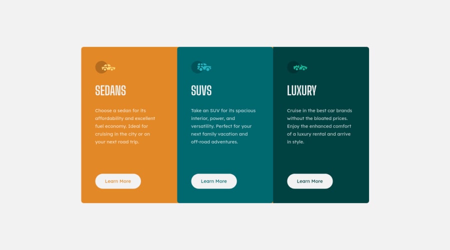
Hello guys, I think I'm improving my HTML/CSS knowledge bit by bit and I'm enjoying it! For this project I tried CSS Grid, how did I do and how could I improve this?
Community feedback
- @FluffyKasPosted about 3 years ago
Hey, it's a great looking solution! The only thing that can be a bit better is your
border-radius
. If you set abackground-color
for each section, then add theborder-radius
andoverflow: hidden
to the container, it will work. Right now, I believe the reason it's not working is that you use the yellowish color as a background for the container element and not for the first child. Very small thing and easy to fix. Good job! :)Marked as helpful1@iliwiliPosted about 3 years ago@FluffyKas Hey, first of all I would like to thank you for the quick feedback! So I actually knew there was something incorrect with the outcome, but I followed the figma file without looking at the final images and that's why it looks weird.
I'm going to change it and hopefully not forget looking at the final images of the challenge. Thank you! :)
0
Please log in to post a comment
Log in with GitHubJoin our Discord community
Join thousands of Frontend Mentor community members taking the challenges, sharing resources, helping each other, and chatting about all things front-end!
Join our Discord