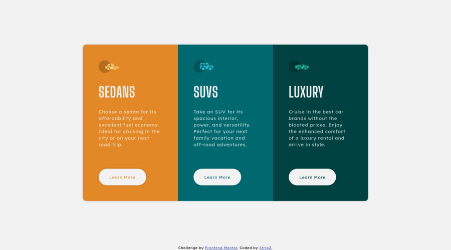
Design comparison
Solution retrospective
Hello!
Why border-radius property on a container (.card in my case) does nothing in my code? I had to use border-radius on every <section> to make edges rounded :(
Also, changing color property for every button text is a good idea here? Can "transparent" color value find use here?
Thanks!
Community feedback
- @PhoenixDev22Posted almost 3 years ago
Hello StrigZ, Your solution is really nice . I have few suggestions : HTML:
- Swap the buttons for anchor tags. Clicking those "learn more" buttons would trigger navigation not do an action so button elements would not be right.(buttons are for actions like opening a modal, submitting a form, toggling an element,)
-Whenever you include interactive elements (buttons, links, input, textarea), make sure you include clearly visible
focus-visiblestyles as well as hover ones. This will make the users can navigate this website using keyboard (by using Tab key) easily. For future use , you have to specify the type of button .
To get rid of the accessibility issues you can add a
<h1>withclass="sr-only"(Hidden visually, but present for assistive tech).`` .sr-only {
border: 0 !important;
clip: rect(1px, 1px, 1px, 1px) !important;
-webkit-clip-path: inset(50%) !important;
    clip-path: inset(50%) !important;
height: 1px !important;
margin: -1px !important;
overflow: hidden !important;
padding: 0 !important;
position: absolute !important;
width: 1px !important;
white-space: nowrap !important;
} ``
This fairly modern technique will hide or clip content that does not fit into a 1-pixel visible area. Like off-screen content, it will be visually hidden but still readable by modern screen readers.
I really hope this feedback helps . happy and keep coding.
Marked as helpful1 - Swap the buttons for anchor tags. Clicking those "learn more" buttons would trigger navigation not do an action so button elements would not be right.(buttons are for actions like opening a modal, submitting a form, toggling an element,)
-Whenever you include interactive elements (buttons, links, input, textarea), make sure you include clearly visible
- @darryncodesPosted almost 3 years ago
Hi Strigz,
You'd need
overflow: hidden;on.cardfor it to work (withborder-radius: 10px;).I don't think there is a better way to add color to each button text. Inherit can be useful in some circumstances.
- you should update your height on the
<body>tomin-height: 100vh;, it's dynamic and will stop the design from being cut off when it transitions to a column (some padding on the body might help the design breathe a little here too) - you might want to add
transition: ease .3s;to your button to make the hover affect smoother
Good to see another solution from you, keep up the momentum!
Marked as helpful1 - you should update your height on the
Please log in to post a comment
Log in with GitHubJoin our Discord community
Join thousands of Frontend Mentor community members taking the challenges, sharing resources, helping each other, and chatting about all things front-end!
Join our Discord
