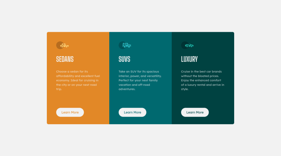
3 Column Preview Card Component using Tailwind CSS
Design comparison
Solution retrospective
π Hello all,
I would appreciate some feedback on whether I have used the correct tag for card element or feedback on anything else would be helpful.
Community feedback
- @vanzasetiaPosted almost 3 years ago
Hi, Deepak! π
Congratulations on finishing this challenge! π Nice work on this challenge! π
Your solution looks good on both landscape and portrait mobile views and on my desktop view! π
I would recommend writing your own styling for the newbie challenges to strengthen your CSS skill.
I have some feedback on this solution:
<img src="images/icon-suvs.svg" width=64 height=40 alt />
I would recommend wrapping the value of thewidth
andheight
properties with double quotes and making thealt=""
look like that.<img src="images/icon-suvs.svg" width="64" height="40" alt="" />
.- Every page should only contain one
h1
as an identifier of each page. So, change all the currenth1
toh2
, and like @AndyGlz01 has said earlier, if this is a full website, theh1
would exist somewhere else on the page. - Create a custom
:focus-visible
styling to any interactive elements (button
, links,input
,textarea
). This will make the users can navigate this website using keyboard (by usingTab
key) easily.
I hope this helps! Keep up the good work! π
Marked as helpful1@Sdann26Posted almost 3 years ago@vanzasetia It is true that every website should have only one h1 per page but in this case, being an isolated component, how could you erase the accessibility problem by not having any h1 in your project?
0@vanzasetiaPosted almost 3 years ago@Sdann26 You could have a hidden
h1
withsr-only
styling. It's visually hidden, but still accessible by the screen reader. In this case, having ah1
is not a necessary thing.Marked as helpful0@Sdann26Posted almost 3 years ago@vanzasetia I understand, for example, this could be the solution to this problem:
.sr-only { position: absolute; left: -10000px; width: 1px; height: 1px; top: auto; overflow: hidden; }
0 - @deepak-parmarPosted almost 3 years ago
What is the best way to deal with
Page should contain a level-one heading
warning? I kept my<h1>
heading hidden, but it didn't work.1@Sdann26Posted almost 3 years ago@deepak-parmar The problem is that you have set the
h1
tag as hidden. Change theh2
of each section to ah1
.If you want to see this type of errors before uploading your solution download AxeDevTools which is a browser extension to see accessibility problems.
Marked as helpful1@AndyGlz01Posted almost 3 years agoI don't recommend to use <h1> in this exercise, because is only one component of a complete web, where we can find another <h1>. i think
0@Sdann26Posted almost 3 years ago@AndyGlz01 It is true that it is only one component, in fact it should not even have h2. But that doesn't take away the accessibility problem which I think could be avoided only for this case unless you have a solution.
Edit: I already saw the interesting solution using
.sr-only
to not display text but be detected by the screen reader :O0 - @AndyGlz01Posted almost 3 years ago
Is perfect!!! Just add some margin-top, height of the cards!
0
Please log in to post a comment
Log in with GitHubJoin our Discord community
Join thousands of Frontend Mentor community members taking the challenges, sharing resources, helping each other, and chatting about all things front-end!
Join our Discord