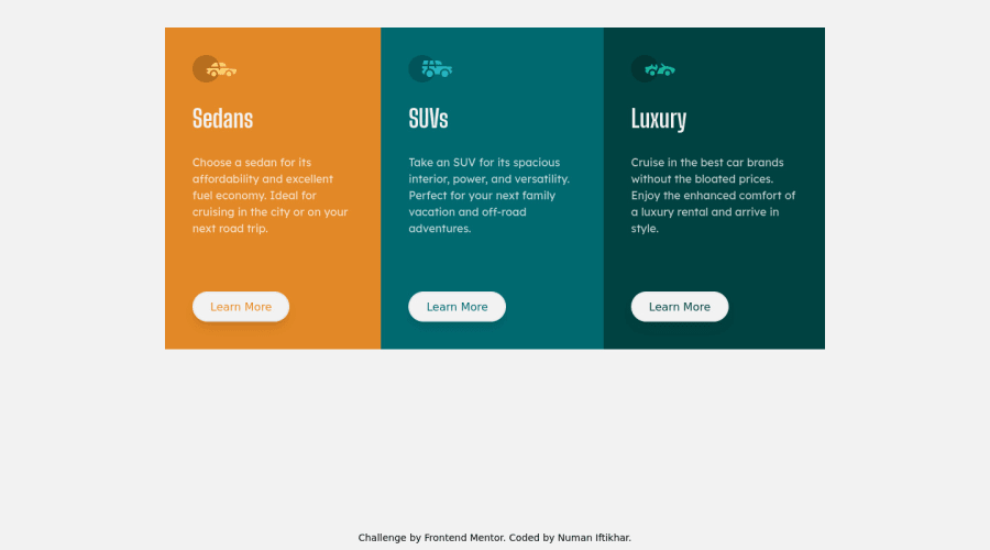
3 column preview card component using tailwind and flexbox
Design comparison
Solution retrospective
- What's the mobile first approach?
- How to know the exact width of FEM projects?
- Any helpful pointers are warmly welcomed!
Community feedback
- @grace-snowPosted about 2 years ago
Hello
Here's some feedback
- Make sure you give your component a max-width. Zoom out lots on your screen and you'll see the issue
- Same on mobile - give it a smaller max-width so it stays closer to the design. It looks really wide on large mobiles at the moment
- Width 70% on mobile is way too narrow. My phone is 320px wide and the side gutter on this is huge at the moment
- Looks like border-radius is missing
- Realistically, this component would sit on a web page with a h1 above it. You wouldn't ever three h1s on a page, so make these h2s
- Make the attribution on this a footer element.
That's all from me, this looks good!
Marked as helpful1@numan-iftikharPosted about 2 years ago@grace-snow Thanks for your suggestions. I'll definitely incorporate them ASAP.
0@numan-iftikharPosted about 2 years ago@grace-snow Hey, I've struggled making it look good on wide mobiles. I tried max width on individual cards but it didn't work. I also tried tailwind breakpoints but still didn't work. May be there's some issue with tailwind
0@grace-snowPosted about 2 years ago@numan-iftikhar max width on the whole component, not individual cards.
There won’t be any issue with tailwind, but maybe with the way you’re using it. I don’t use tailwind so wouldn’t know, but reading the docs gives answers on libraries like that
0
Please log in to post a comment
Log in with GitHubJoin our Discord community
Join thousands of Frontend Mentor community members taking the challenges, sharing resources, helping each other, and chatting about all things front-end!
Join our Discord
