Submitted over 3 years ago
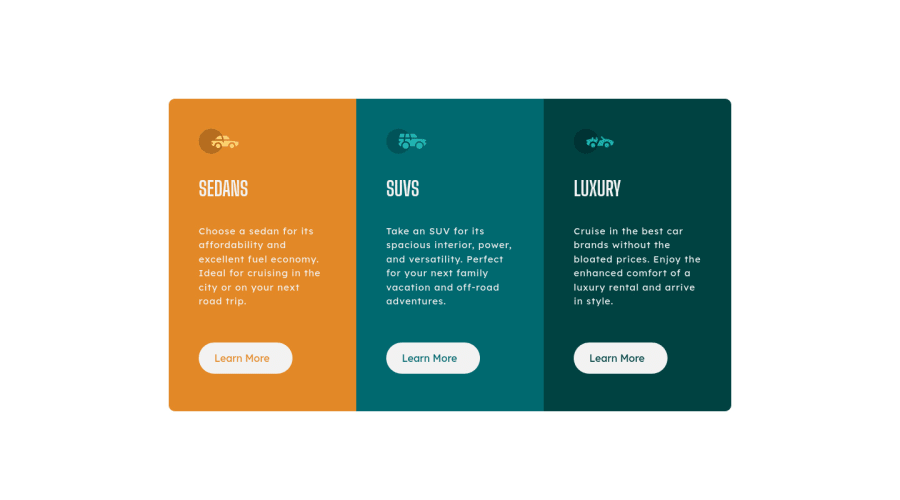
3 Column Preview Card Component using HTML and CSS (Mobile Responsive)
@roguepanther
Design comparison
SolutionDesign
Solution retrospective
Was really fun completing this challenge and getting the design to look as close as possible to the original design.
One thing I noticed is that despite using the font included in the style guide, the font appearing in the live site looks much thicker than the original. If anyone has an idea if I have done something obvious, that would be great.
Thank you :)
Community feedback
Please log in to post a comment
Log in with GitHubJoin our Discord community
Join thousands of Frontend Mentor community members taking the challenges, sharing resources, helping each other, and chatting about all things front-end!
Join our Discord
