Submitted over 2 years ago
3 column preview card component using HTML & CSS
@Priyanshii677
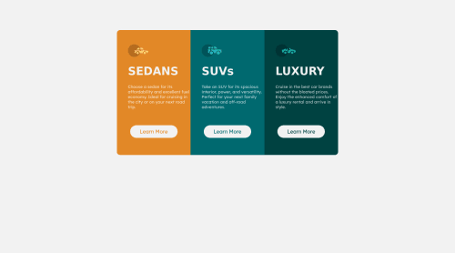
Design comparison
SolutionDesign
Solution retrospective
Hey Everyone!!! Kindly review my solution and do share your feedback so that I can improve my frontend skills. Happy Coding!!!
Community feedback
- @tesla-ambassadorPosted over 2 years ago
Hey Priyanshi! This is a really great solution! Congrats! Here's a few key things to note:
- You might want to improve on your responsiveness by adding a few more break points in your media queries. Forexample you could add a break-point when your screen is at 700px and then you could could change your flex-direction to column (
flex-direction: column
) on your ".flex-container" class. - On the mobile view, I think you could set the height of the flex container to 100vh and then you could increase the width of the flex-container to like 90% of the screen so that the content can be seen more clearly.
- Then in order to fix your accessiblity issues and your HTML validation issues, you should add an "alt" attribute to your image element. Fixing these will enable browsers to properly maneuver your website. Awesome work and happy coding too!
Marked as helpful1@Priyanshii677Posted over 2 years ago@tesla-ambassador Thank you so much. I will certainly consider these suggestions and improve my code.
1 - You might want to improve on your responsiveness by adding a few more break points in your media queries. Forexample you could add a break-point when your screen is at 700px and then you could could change your flex-direction to column (
Please log in to post a comment
Log in with GitHubJoin our Discord community
Join thousands of Frontend Mentor community members taking the challenges, sharing resources, helping each other, and chatting about all things front-end!
Join our Discord