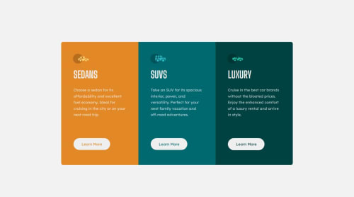
Submitted over 3 years agoA solution to the 3-column preview card component challenge
3 Column Preview Card Component Using HTML & CSS
@SergioZF09

Solution retrospective
1.- It was a bit confusing the sizes to desktop I had to use, because the size of my monitor is different from other monitors. However, I guess I did it well.
2.- I don't know if it would've been better to use another div or something different to group the three sections that I did.
3.- Not now. But, if you see something wrong in the code, you can write a different option or different way to do.
Any feedback is welcomed!!
Code
Loading...
Please log in to post a comment
Log in with GitHubCommunity feedback
No feedback yet. Be the first to give feedback on Sergio Fraga's solution.
Join our Discord community
Join thousands of Frontend Mentor community members taking the challenges, sharing resources, helping each other, and chatting about all things front-end!
Join our Discord