Design comparison
Solution retrospective
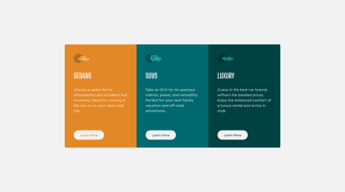
I use the absolute position on each column's button so they will always stay equal at the bottom. Is it alright? Or is there a much better approach to this? Any suggestions will be helpful, thanks!
Community feedback
- @correlucasPosted about 2 years ago
👾Hi Odalloc, congrats on completing this challenge!
You’ve done really good work here putting everything together, I’ve some suggestions to improve the design:
1.Improve your html markup using meaningful tags to wrap the content, you can replace the div you’ve used for each card with <article>. Remember to wrap big blocks of content with semantic tags and never divs, use divs for small blocks.
2.To make your CSS code easier to work you can create a
single class
to manage the content that is mostly the same for the 3 cards (paddings, colors, margins and etc) and another class to manage the characteristics that are different (colors and icon), this way you'll have more control over then and if you need to change something you modify only one class.✌️ I hope this helps you and happy coding!
Marked as helpful1 - @abhay8696Posted about 2 years ago
Hey @Odalloc, great work you have did here. I've used flexbox to give proper spacing to the contents of the cards. Here's what I did to card div: display: flex; flex-direction: column; align-items: flex-start; justify-content: space-evenly;
You can also add "role = 'main' " attribute in section element to resolve accessibility issue.
Marked as helpful1@OdallocPosted about 2 years agoHi @abhay8696, I've never thought of using flex for spacing the contents on each column evenly. I'll try that next time. Thanks!
0
Please log in to post a comment
Log in with GitHubJoin our Discord community
Join thousands of Frontend Mentor community members taking the challenges, sharing resources, helping each other, and chatting about all things front-end!
Join our Discord