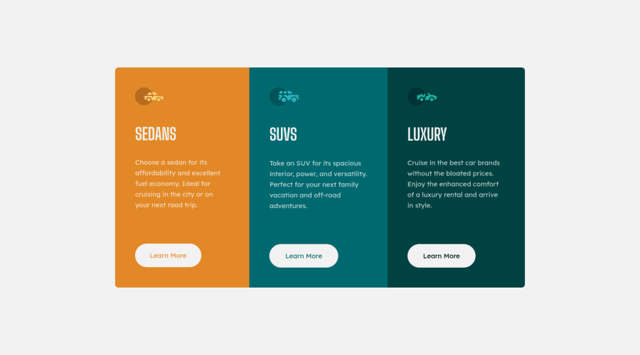
Design comparison
Solution retrospective
I feel myself getting better at this and hoping that I reached the desired result on my first attempt.
If anybody has any criticism, advice, or feedback. It is so greatly appreciated if you could take some time out of your day to leave a comment. I am doing my absolute best to improve everyday.
Community feedback
- @CyrusKabirPosted over 3 years ago
hello my dear friend ♥ your cards at all are good and clean but here some tips :
- we can't see any hover state in your code
- and it's better to keep cards in this design in row when viewport it's more than 1000px or something like that you know what i mean but at all it's good but try to improve it for sharping your skills ♥♥♥
Marked as helpful1@kenreibmanPosted over 3 years ago@CyrusKabir Thank you for the feedback! I did not add a hover state because I believe the design asked for an active state and not a hover.
0 - @kenreibmanPosted over 3 years ago
Does anybody have advice on how to have the content align with the original design properly?
I made sure to have a container surrounding the main card component. I set the container height to a 100vh and justified its content center to center the main card in the middle of the page(justify-content: center;) -- yet my result seems to be a few pixels above the original design.
0@kenreibmanPosted over 3 years ago@lmaoken Giving it more thought, it might be because I didn't style the footer at the bottom which pushed the page up a little.
0
Please log in to post a comment
Log in with GitHubJoin our Discord community
Join thousands of Frontend Mentor community members taking the challenges, sharing resources, helping each other, and chatting about all things front-end!
Join our Discord
