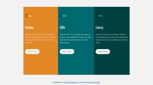
3 column preview card component using flexbox, and CSS selectors
Design comparison
Solution retrospective
Special thanks to Frontend Mentor community, I was trying to find some best practice to calculate padding and margin properties, any suggestions for improvement I appreciate it
Community feedback
- @willettoPosted over 2 years ago
Hey Imad! Nice work. And good questions too. Knowing what you need to learn is a challenge in itself. Generally, I don't use margins. Almost everything can be done with padding and using flex/grid alignment.
I would add a class of 'card' to each div, and add CSS styling the card. If you set the layout to either grid or flex, you can then set the spacing between each item.
.card {display: flex; flex-direction: columns; justify-items: space-between; padding: 20px;}
-This video might be helpful in understanding the difference between padding and margin.
-And this may be helpful in understanding flex-box, which can auto-calculate spacing for you.
Lastly, I love the border-radius on the desktop layout, but it gets a bit weird on the mobile. Take the border-radius off of your section elements, and just leave it on the main. Then add
overflow: hidden;
to your main {}. That took me a while to figure out.Marked as helpful1 - @denieldenPosted over 2 years ago
Hi Imad, I took some time to look at your solution and you did a great job!
Also I have some tips for improving your code:
- to make it look as close to the design as possible add to
main
tag this properties:
align-items: center; border-radius: 1rem; overflow: hidden;
- remove all
margin
fromcontainer
class because with flex they are superfluous
Tip of graphic design: With
font-family:" Big Shoulders Display ", cursive
the browser will use the Comics Sans font when it doesn't find the first font indicated (you can seen during loading) ... for the designer it's a really awful font!- I would rather replace it with a
font-family:" Big Shoulders Display ", sans-serif
much more similar to the primary font.
Overall you did well 😉
Hope this help and happy coding!
Marked as helpful1 - to make it look as close to the design as possible add to
Please log in to post a comment
Log in with GitHubJoin our Discord community
Join thousands of Frontend Mentor community members taking the challenges, sharing resources, helping each other, and chatting about all things front-end!
Join our Discord