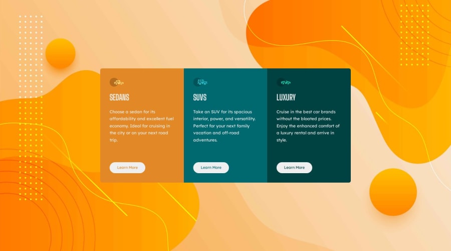
Design comparison
SolutionDesign
Community feedback
- @77iuPosted about 1 year ago
hey! That background is amazing! It has motivated me to try it🤔.
I suggest you look better at the responsive area, to begin with the container of the three columns should have flex-direction:column
I invite you to review my solution to that exercise, like you I am also learning but maybe it will be useful for you to review it, if so please let me know 😃.
Greetings!
0
Please log in to post a comment
Log in with GitHubJoin our Discord community
Join thousands of Frontend Mentor community members taking the challenges, sharing resources, helping each other, and chatting about all things front-end!
Join our Discord
