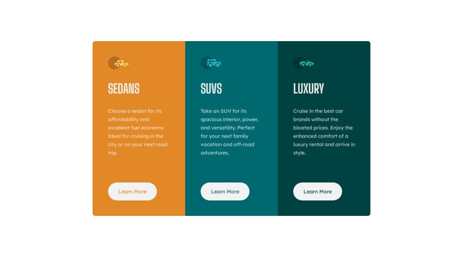
Design comparison
SolutionDesign
Solution retrospective
What are you most proud of, and what would you do differently next time?
- Apply Flex and Grid both for layout design;
- I will try to use grid layout more often from now on as it looks too easy for design card-containers.
- This challenge is easy, but those
border-radiuspart on first and third card was pretty tricky for me. Little bit of internet search helps at the end.
- Understanding more how Flexbox and Grid layout works on different projects
Community feedback
Please log in to post a comment
Log in with GitHubJoin our Discord community
Join thousands of Frontend Mentor community members taking the challenges, sharing resources, helping each other, and chatting about all things front-end!
Join our Discord
