Design comparison
Solution retrospective
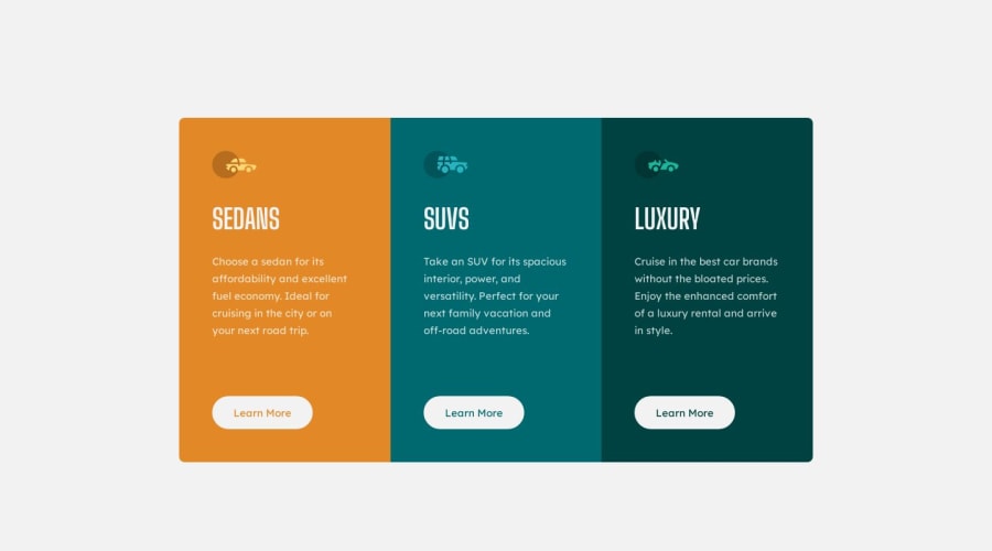
Hello, I have a problem with the screenshot generation. My code works normally in browsers, but the generated screenshot is different from my code. How could I solve this problem? Thank you very much :)
Community feedback
- P@FluffyKasPosted about 1 year ago
Hey,
Your solution looks great! I'm not a 100% sure what's causing the problem with the screenshot. If I had to take a guess it has to do something with the
font-size: inherit
. I changed the font size to 1rem and that way I was able to recreate the weird behaviour that you can see on the screenshot. If you leave it on inherit, the computed value is only 15px, so that's 1px difference. Maybe you could try to set the font-size in your code explicitly to 0.9375rem. The problem didn't show up on my end so I'm not a 100% sure but that's all I could think of now.Some other things to note:
- Your website your should only have one h1. This is like a main title for a webpage. In this case, since it's just a component you probably don't even need a h1, these headings could be h2 or h3.
- Alt texts are displayed in lieu of an image but if the image only serves decorative purposes (like these icons do), you should leave the alt texts blank, so screen readers can skip it.
Everything else seems great to me, responsiveness is really nice too. Well done!
Marked as helpful1@oanh-hthPosted about 1 year ago@FluffyKas Wow thank you so much for your review :D. I have tried to change the font size to 0.9375rem but the screenshot does not change :( By the way, in this situation, I have read that we can use multiple h1 on a page intentionally because I have 3 articles on my page and one h1 tag per article. You can take a look at this link, someone has asked about using multiple h1 on stackoverflow.
Again, thanks a lot for your feedback ^^
0P@FluffyKasPosted about 1 year ago@oanh-hth
Well, fortunately it's just the screenshot so if this doesn't show up in the live site, then I wouldn't dwell too much on it.
As to the heading problem, just like with anything else, it's important to double-check the source you're using and stack overflow isn't always something to go by - especially a question that was asked 14 years ago >.> The web has changed a lot since then. If you're interested in this, you can check MDN which is always a great resource or the a11y project website, they are both a lot more up to date when it comes to accessibility questions like this. Just something useful to take note of in the future! :)
Marked as helpful1@oanh-hthPosted about 1 year ago@FluffyKas thanks a lot for these best practices 😄, accessibility’s till a confusing thing to me 😅
0 - @angelodedaldinoPosted about 1 year ago
hello my name's angelo could you spare a couple of minutes explained how did you solve the issue of component overflowing when stretching the screen?
0@oanh-hthPosted about 1 year ago@angelodedaldino Hi there, I set the width for the main container based on the viewport width :)
0@oanh-hthPosted about 1 year ago@angelodedaldino like this width: min(100vw - 3rem, 57.5rem); overflow: hidden; I use the min function to set the width of the main container which is a <main> tag wrapping three columns. You can see my code for more information :)
0
Please log in to post a comment
Log in with GitHubJoin our Discord community
Join thousands of Frontend Mentor community members taking the challenges, sharing resources, helping each other, and chatting about all things front-end!
Join our Discord