Design comparison
SolutionDesign
Solution retrospective
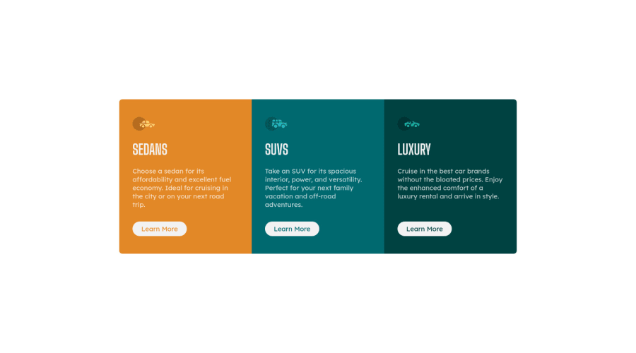
Feedbacks are appreciated. Am I doing this the right way? I mean to make and position card.
Community feedback
- @arkharman12Posted over 3 years ago
I think you are missing the hover states and height of the component needs to be higher compared to the design.
0@coderSureshPosted over 3 years ago@arkharman12 Hey, I have now changed my code. Kindly have a look and let me know if you think it's fine now. Thanks for your help.
0
Please log in to post a comment
Log in with GitHubJoin our Discord community
Join thousands of Frontend Mentor community members taking the challenges, sharing resources, helping each other, and chatting about all things front-end!
Join our Discord
