Submitted about 2 months ago
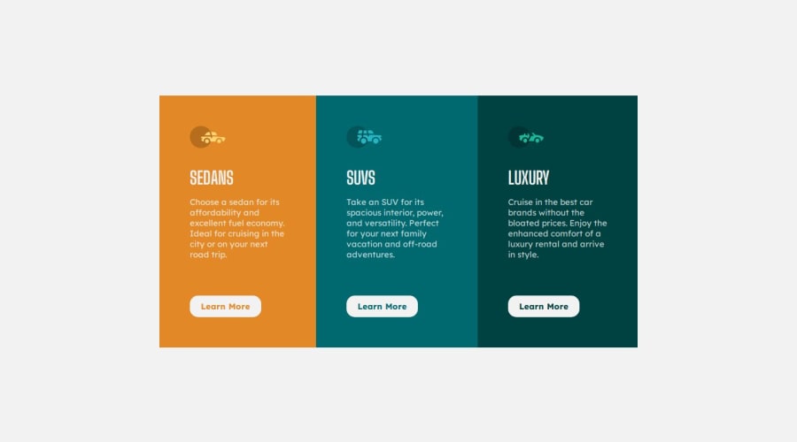
3-column preview card component solution

@HaseebaAlhaddi

Design comparison
SolutionDesign

Community feedback
- @devceejayPosted about 2 months ago
Hello! @haseebaalhaddi Great job on the project! but here's my observation, I noticed that you used the h1 tag throughout the entire document. Typically, the h1 tag should be reserved for the main heading of the page, as it helps define the primary topic. For better structure, consider using h2 for main sections. This will improve the document's hierarchy, making it easier for both users and search engines to understand the content. It will also enhance accessibility and SEO.
Hope you find this feedback helpful. Good job overall!
Happy Coding!
0

Please log in to post a comment
Log in with GitHubJoin our Discord community
Join thousands of Frontend Mentor community members taking the challenges, sharing resources, helping each other, and chatting about all things front-end!
Join our Discord