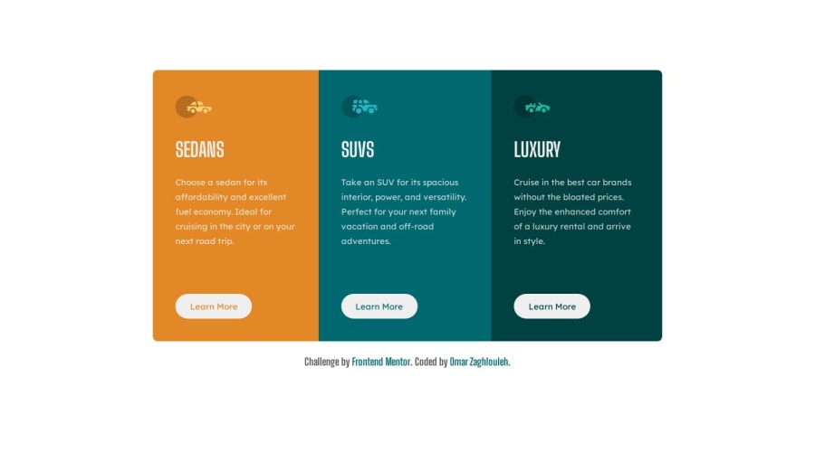
Design comparison
Solution retrospective
Hi 🙋🏻♂️ this is my solution for 3-column-preview-card-component challenge...please take look and give me your feedback! Thanks 😊.
Community feedback
- @ratul0407Posted 12 months ago
@OmarZaghlouleh Hey there coder🚀🚀, congrats on completing another frontend mentor challenge🎉🎉
The solution looks really great, The animation is also nice. But you might consider changing some of your code :)
The only Thing that grab my attention was your usage of media query, it's not that your solution isn't responsive. It is responsive but the way you've used your media query's looked a little odd to me. Because everyone prefers using min-width so that we can start from mobile to desktop. But if you prefer using max-width that's also completely fine. Everyone has there own preference. But you might consider doing a little bit of research on how to use media query a little bit more efficiently. This article from free code camp.org might help you😄.
I hope you found this helpful👍👍
Have a very nice day and keep up the good work🌝🌝
Marked as helpful2@OmarZaghloulehPosted 12 months ago@ratul0407 Thank you very much for the feedback, I will keep that in mind and do research to improve my code. Have a nice day and thanks for the article😊.
1
Please log in to post a comment
Log in with GitHubJoin our Discord community
Join thousands of Frontend Mentor community members taking the challenges, sharing resources, helping each other, and chatting about all things front-end!
Join our Discord
