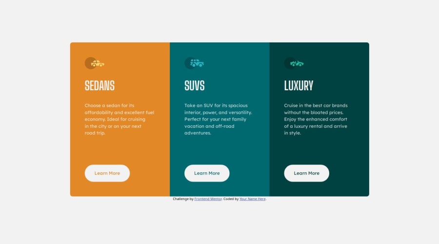
3 Column Preview Card Component
Design comparison
Solution retrospective
Overall code feedback especially the organization of code or any bad practice that I might've overlooked?
Community feedback
- @grace-snowPosted 5 months ago
This looks pretty good but I spot a few issues.
- there is no h1 in this design. All headings should be at the same level (h2). Sedans is not the heading for the whole page / all other content so shouldn't have a h1.
- it's important when link text repeats like this that the accessible name is unique to the context where those links are placed in the content. The easiest way to do that would be adding the car type into the links insode a visually-hidden (sr-only) span.
- in the large screen view the paragraphs should have margin-bottom auto. This is so that the buttons are always aligned at the bottom of the cards, even if one card has a longer paragraph.
- make sure you add a little padding to the body or main on this so content can't hit the screen edges.
Marked as helpful2
Please log in to post a comment
Log in with GitHubJoin our Discord community
Join thousands of Frontend Mentor community members taking the challenges, sharing resources, helping each other, and chatting about all things front-end!
Join our Discord
