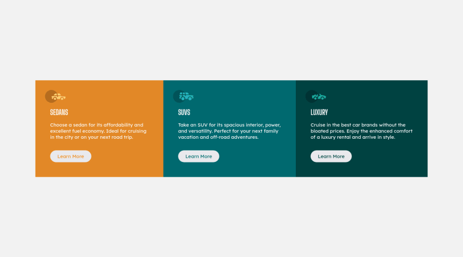
Design comparison
Solution retrospective
Is there a way to make the buttons stay in place as the browser shrinks?
Let me know if you see other problems. Thank you :)
Community feedback
- @DrMESAZIMPosted about 3 years ago
Hi Jemo
I had time to look at your site I just want to add some coding to make it mobile responsive on smaller screen as well the border-radius on different views
Inside the file css/style.css lets add the following code
- line 148 add the following .wrapper{ display: flex; flex-direction: column;}
2.line 153 add
.bg-orange{ border-top-right-radius: 5px; border-top-left-radius: 5px;
}
.bg-darkCyan{
border-bottom-left-radius: 5px;
 border-bottom-right-radius: 5px;
}
3 . line 205 add
.bg-orange{ border-top-left-radius: 5px; border-bottom-left-radius: 5px; }
.bg-darkCyan{ border-top-right-radius: 5px; border-bottom-right-radius: 5px; }
Marked as helpful0 - @isprutfromuaPosted about 3 years ago
Frontendmentor
Hi there. You did a good job 😎
🛠️
keep improving your programming skills
your solution looks great, however, if you want to improve it, you can follow these steps:
✅ please add focus state for buttons
.button:hover {
  border: 1px solid hsl(var(--clr-white));
  color: hsl(var(--clr-white));
  cursor: pointer;
  background: hsl(var(--clr-brightOrange) / 100%);
}

.btn-suv:hover {
  background: hsl(var(--clr-darkCyan) / 100%);
}

.btn-luxury:hover {
  background: hsl(var(--clr-veryDarkCyan) / 100%);
}
✅ place the Google import code such that it loads first directly after the html HEAD tag, EVEN before loading the CSS file. This ensures the fonts load before the CSS so there isn't any unexpected "jumping" of when the font finally loads.
I hope my feedback will be helpful. You can mark it as useful if so 👍
Good luck and fun coding 🤝⌨️
Marked as helpful0
Please log in to post a comment
Log in with GitHubJoin our Discord community
Join thousands of Frontend Mentor community members taking the challenges, sharing resources, helping each other, and chatting about all things front-end!
Join our Discord
