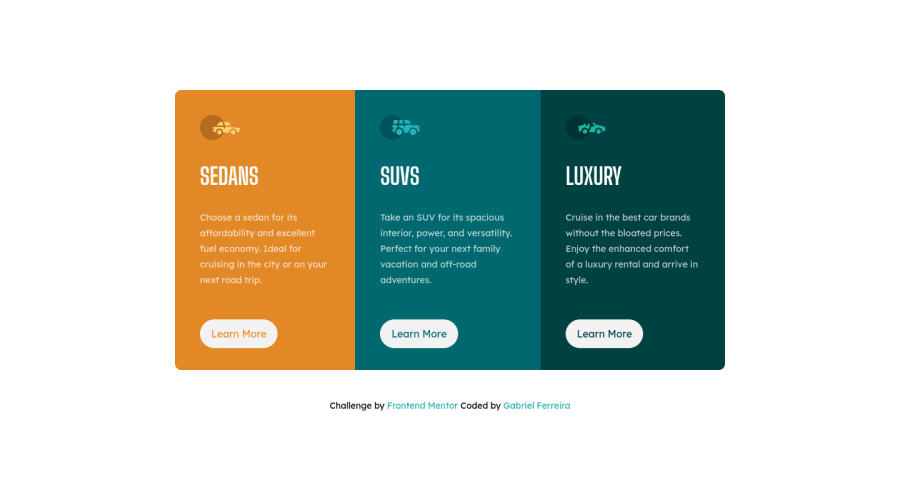
3 column preview card component quasi responsive
Design comparison
Solution retrospective
I used someone's advices to do this challenge better than the previous time. I think now it's better but I have some questions :
- How to put a div at the bottom of another div ? I talk about the buttons Learn More in this challenge, because I wanted to do a progressive responsive design but the buttons go out of the flex. Here I did a simple responsive so we can't see.
- When I was doing the media queries, there was a space at the top of the section but not at the bottom, so it wasn't centred in the page. If you have answer to those questions or other advices, please tell me :).
Community feedback
- @pikapikamartPosted about 3 years ago
Hey, great work on this one. This solution is really nice to look at^^. Layout looks great, it is responsive and mobile state looks great.
For your questions:
- To be honest, I am confused about the question:>. If you see this one, explaining it a bit would be great.
- So I tried seeing the breakpoint and it looks good on my end. Are you referring to mobile state where the
main
has only small height. If that's it, it is because you are usingheight: 100%
on themain
which is relative to thebody'
sheight: 100%
which you shouldn't do. Also on thesection
it is usingheight: 28rem
.
Aside from those, here are some suggestions:
- Avoid using
height: 100%
on thebody
orhtml
as it will be relative to the screen of the user. This will limit the height. Usemin-height: 100vh
instead so that the layout's height will expand if needed. - Also, on your markup, remove those
meta
tags andlink
inside thebody
tag. Those should be placed inside thehead
. - On the
main
tag, to make the layout centered, usemin-height: 100vh
and replace theheight: 100%
by it. - It would be great to make the
footer
outside of themain
so that it will be on its own row:
<main /> <footer />
- When you are using
aria-hidden="true"
on an image, make sure that you are usingalt=""
since you are hiding the image. - Also, When using
img
tag, you don't need to add words that relates to "graphic" such as "picture" and others, sinceimg
is already an image so no need to describe it as one.
Those only, again, great job for this one.
Marked as helpful0@Gab-FerreiraPosted about 3 years agoHello @pikamart, thanks for advices. Today I learnt that if we don't a height on a div in flex, the div is responsive, so it resolve my questions.
For the meta tags, I don't know why those tags were in the body because on my code they are only in the head tag x).
Again thank you !
1
Please log in to post a comment
Log in with GitHubJoin our Discord community
Join thousands of Frontend Mentor community members taking the challenges, sharing resources, helping each other, and chatting about all things front-end!
Join our Discord