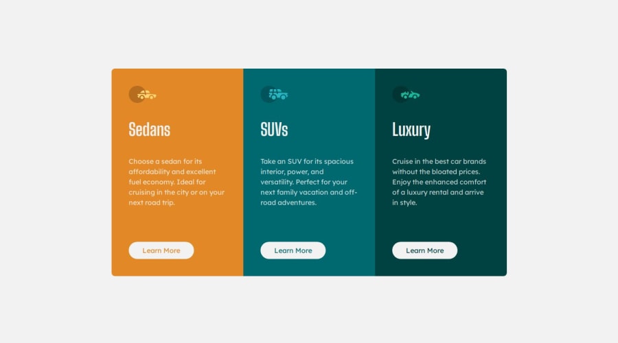
Design comparison
Solution retrospective
Just a little training.
What challenges did you encounter, and how did you overcome them?None.
What specific areas of your project would you like help with?Nothing special, unless you see something ;)
Community feedback
- @programmerjewelPosted 5 months ago
Congratulations 🎉🎉 on finishing this project. Few suggestions to improve your project.
-
You have used
ptag to designLearn Morebutton. You should go forbuttonoratag for styling. On this project,atag is more appropriate for styling learn more. -
I have seen a little bug on
learn morelink. When to put cursor on it, card try to add some space on the bottom. Try to fix it.
Overall good design.
Marked as helpful0 -
Please log in to post a comment
Log in with GitHubJoin our Discord community
Join thousands of Frontend Mentor community members taking the challenges, sharing resources, helping each other, and chatting about all things front-end!
Join our Discord
