Not Found
Not Found
Not Found
Not Found
Not Found
Not Found
Not Found
Not Found
Not Found
Not Found
Not Found
Not Found
Not Found
Not Found
Not Found
Not Found
Not Found
Not Found
Not Found
Not Found

Submitted

3-column-preview-card-component-main

@Gayatri0109

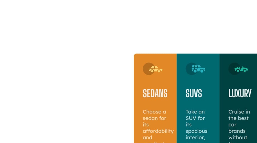
Desktop design screenshot for the 3-column preview card component coding challenge

This is a solution for...

  • HTML
  • CSS
1newbie
View challenge

Design comparison


SolutionDesign

Solution retrospective


What are you most proud of, and what would you do differently next time?

I'm most proud about the thing that i know the concepts up to the mark and i'm easily able to understand and rectify the errors. The next time i do this task i will do it in a more simple and professional way.

What challenges did you encounter, and how did you overcome them?

web development is nothing but accuracy.There should not be any errors even 0.1% is not acceptable achieving the accuracy is little difficult.By practicing ,i have overcome it.

Community feedback

@TedJenkler

Posted

Hi @Gayatri0109,

Nice project! Here are a few suggestions for improvement:

Avoid Using IDs for Styling: I noticed you’re using IDs frequently in your project. It’s generally better to use classes for styling instead of IDs. Classes are more reusable and maintainable, which makes your CSS easier to manage. Additionally, using IDs can lead to CSS specificity issues. Also, consider learning Flexbox for more flexible and easier layouts.

Add ARIA Labels: To enhance accessibility, consider adding ARIA labels to describe the content of your <div> elements. This practice is particularly useful in larger projects, as it helps screen readers understand the purpose of each element.

Hope these suggestions are helpful!

Best, Teodor

Marked as helpful

0

@soymze

Posted

Hey, your solution looks pretty same with the design.There are only 2 things that I saw as a problem.First one is positioning.Your card is not in the middle,It is in the way more right side of the viewport and I checked your css file.I think if you use percent values instead of pixels, the card is going to be more responsive.The other thing is when I previewed your solution, one of the buttons were out of the div.So maybe you can use flexbox for that.Cause I coded this design yesterday and had the same problem.The length of p elements are different and because of that alligning buttons is hard.Happy coding :)

Marked as helpful

0

Please log in to post a comment

Log in with GitHub
Discord logo

Join our Discord community

Join thousands of Frontend Mentor community members taking the challenges, sharing resources, helping each other, and chatting about all things front-end!

Join our Discord