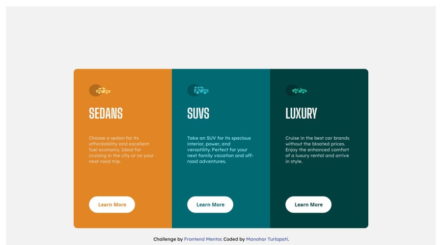
Design comparison
Solution retrospective
I’m most proud of how I successfully created a clean and responsive design that effectively showcases the different car categories (Sedans, SUVs, Luxury) with distinct colors and layouts. The use of contrasting colors helps to differentiate each section clearly, which I believe enhances the user experience.
Next time, I would like to focus on adding more interactive elements, such as animations or hover effects, to make the buttons and icons more engaging. Additionally, I would consider exploring more modern design trends to enhance the visual appeal further.
What challenges did you encounter, and how did you overcome them?One of the challenges I faced was ensuring that the design was fully responsive across different screen sizes. Initially, the layout didn’t scale well on smaller devices, which caused elements to overlap or appear misaligned. I overcame this by using CSS Flexbox and media queries to create a flexible grid that adapts smoothly to various screen sizes.
Another challenge was getting the color scheme right, as I wanted to ensure each section was visually distinct but still cohesive as a whole. I experimented with different color combinations and tested them in various lighting conditions to find the best balance.
What specific areas of your project would you like help with?I would like feedback on the overall design aesthetic, particularly in terms of color usage and typography. I’m also interested in learning how to improve the interactivity of the buttons and icons to make them more engaging for users. Any advice on optimizing the responsiveness for even smaller screen sizes would be appreciated as well.
Community feedback
Please log in to post a comment
Log in with GitHubJoin our Discord community
Join thousands of Frontend Mentor community members taking the challenges, sharing resources, helping each other, and chatting about all things front-end!
Join our Discord
