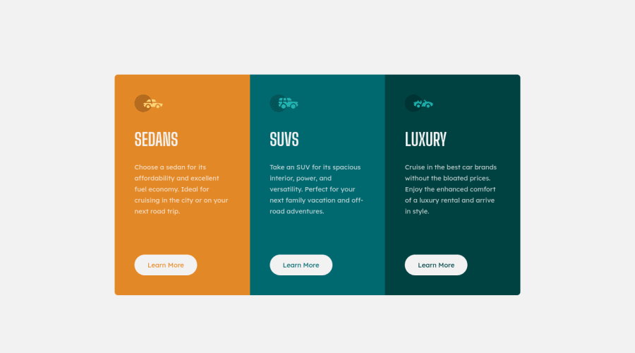
3 column preview card component - HTML/Grid/Sass/Parcel
Design comparison
Solution retrospective
Hi All,
I just updated this solution to be more responsive. 📱-> 🖥️
Did I miss anything? Could I do something better? Let me know. I really appreciate good feedback. 😊
Thanks :D
Community feedback
- @vanzasetiaPosted about 3 years ago
Greetings, Darrick! 👋
Congratulations on finishing this challenge! 🎉
Your solution looks great on my mobile view (both landscape and portrait) and desktop view. Well done! 👍
I have some feedback on this solution:
- Accessibility
- Good job on using
mainandfooterlandmarks correctly! 👍 - Every page should only contain one
h1. In this case, you can have a visually hiddenh1. However, change all the existingh1toh2. - I think the Learn More button will navigate the user to another webpage. What do you think the button will do if the user clicks it?
- For any decorative images, each
imgtag should have emptyalt=""andaria-hidden="true"attributes to make all web assistive technologies such as screen reader ignore those images. In this case, all images are decorative only.
- Good job on using
- Styling
- I would recommend adding some
paddingto thebodyelement to prevent the card from touching the edge of the screen.
- I would recommend adding some
- Best Practice (Recommended)
- Remove the commented code. If another developer (it can be you in the future) wants to improve this solution, he/she might get confused about whether or not the commented code should be used or deleted.
That's it! Hopefully, this is helpful! 😁
Marked as helpful1P@DarrickFauvelPosted about 3 years ago@vanzasetia This is excellent advice, Vanza!
Thank you so much for taking a look and giving your thoughtful feedback. I will implement these suggestions right away.
Yes, this is very helpful! 😊
1P@DarrickFauvelPosted about 3 years ago@vanzasetia I've implemented all of your feedback and even got the pixels much closer to the design screenshot.
Thank you again for your great feedback, Vanza! I'm going to apply this to my other solutions. 🤓👍
1@vanzasetiaPosted about 3 years ago@DarrickFauvel Wow, that's awesome! It looks like the design! 😍
Keep it up! 👍
1P@DarrickFauvelPosted about 3 years ago@vanzasetia Thank you, Vanza. I really appreciate your encouragement! 👍😀
1 - Accessibility
Please log in to post a comment
Log in with GitHubJoin our Discord community
Join thousands of Frontend Mentor community members taking the challenges, sharing resources, helping each other, and chatting about all things front-end!
Join our Discord
