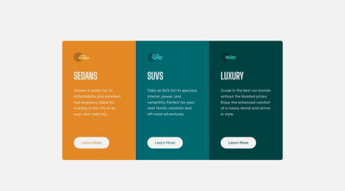
Submitted about 1 year agoA solution to the 3-column preview card component challenge
3 Column Preview Card Component [Flex][Grid]
@flaviocmb

Solution retrospective
What are you most proud of, and what would you do differently next time?
## Justify-self
I got help from justify-self to push down the buttons when the screen size causes the cards to stretch (between the resolutions of 768px and 900px). Therefore, you need to use display: grid; and justify-self together. You don't need to set up columns or rows for this to work.
## Property flex
flex: 1; behaves like 1fr. I used it to ensure that the dimensions of the three cards are adjusted, making them equally sized.
.cards {
    display: flex;
}

.card {
    flex: 1; /* or width: 100%; */
}
Anything. Thank you so much for your time and effort in evaluating this.
Code
Loading...
Please log in to post a comment
Log in with GitHubCommunity feedback
No feedback yet. Be the first to give feedback on Flávio César's solution.
Join our Discord community
Join thousands of Frontend Mentor community members taking the challenges, sharing resources, helping each other, and chatting about all things front-end!
Join our Discord