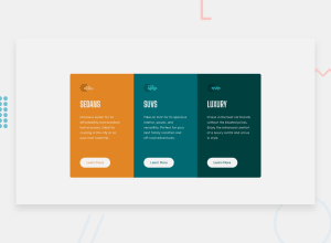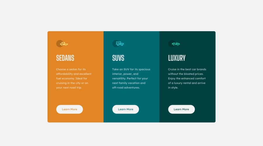
Design comparison
Solution retrospective
This was harder challenge that the previouse. I learned how to better align div vertically, but I am not satisfied with my CSS so I will take a look to see how others did this challenge.
Community feedback
- @jacksen30Posted about 1 year ago
Congratulations @NikolaM4 on submitting your challenge solution, Considering this is only your second FE- mentor project you've done very well !
After viewing your CSS I have some constructive advice on some improvements that could be made. I'd recommend researching these concepts and properties further to better understand them but I will give you the simple explanations and suggestions here, my recommendations don't cover all the possible fixes and refactors possible on your code but more the most impactful ones that will come in most useful to you on future challenges and web design projects.
Border Radius for Cards:
Current: CSS uses the border-top-right-radius and border-bottom-right-radius properties. Instead the border-radius shorthand property can be used this minimises the code required by setting values for all corners in a single line.
This is the current:
.orange-block {
  background-color: var(--orange-color);
  border-top-left-radius: 10px;
  border-bottom-left-radius: 10px;
}

.green-block {
  background-color: var(--green-color);
  border-top-right-radius: 10px;
  border-bottom-right-radius: 10px;
}

@media (max-width: 375px) {

  .orange-block {
    border-radius: 0;
    border-top-left-radius: 10px;
    border-top-right-radius: 10px;
  }

  .green-block {
    border-radius: 0;
    border-bottom-left-radius: 10px;
    border-bottom-right-radius: 10px;
  }
This is the refactored version:
.orange-block {
  background-color: var(--orange-color);
  border-radius: 10px 0 0 10px;
}

.green-block {
  background-color: var(--green-color);
  border-radius: 0 10px 10px 0;
}

@media (max-width: 375px) {

  .orange-block {
    border-radius: 10px 10px 0 0;
  }

  .green-block {
    border-radius: 0 0 10px 10px;
  }
Button Hover Effect:
Current: Separate hover effects are defined for .orange-block button:hover, .blue-block button:hover, .green-block button:hover. Suggestion: To streamline the CSS and prevent repetition, these can be removed. Instead, add a button:hover rule and use background-color: inherit, which will ensure the background color remains consistent upon hovering (seem the background-color required for each is the same as its parent containers background-color).
This is the current:
.orange-block button:hover {
  background-color: var(--orange-color);
  color: hsl(0, 0%, 95%);
}

.blue-block button:hover {
  background-color: var(--blue-color);
  color: hsl(0, 0%, 95%);
}

.green-block button:hover {
  background-color: var(--green-color);
  color: hsl(0, 0%, 95%);
}
This is the refactored version:
button:hover {
  background-color: inherit;
  color: hsl(0, 0%, 95%);
}
Media Query Breakpoint:
Current: The media query breakpoint is set at 375px. Suggestion: Consider increasing the breakpoint to somewhere around 700px. While the design indicates a mobile view at 375px width, that doesn't dictate the optimal breakpoint. Adjusting this can provide a more consistent user experience across varying screen sizes.
Below I've commented within the code some properties that have been incorrectly used and can be removed, and some new ones that I have added to help with the overall layout as well as the responsiveness on the page:
* {
  margin: 0;
  padding: 0;
  box-sizing: border-box;  /* ADDED - When using border-box, the width and height you set for an element will include its padding and border. This makes it simpler to create layouts that maintain a consistent size regardless of the padding or border applied to the element.*/
}

body {
  background-color: hsl(0, 0%, 95%);
  font-family: "Lexend Deca", sans-serif;
  /* position: relative; */  /* REMOVED - Position not required in this context */
  font-size: 15px;
  height: 100vh;

/* ADDED ALL BELOW PROPERTIES - Using these flex properties will help to center the main element thats nested within the body element  */

  display: flex;
  flex-direction: column;
  justify-content: center;
  align-items: center;
}

main {
  /* position: absolute; */  /* REMOVED - Position not required in this context */
  max-width: 850px;
  display: flex;


/* REMOVED ALL BELOW PROPERTIES - These were used with your position property that has now been removed  */
  /* margin: 0 auto; */
  /* top: 50%;
  left: 50%;
  transform: translate(-50%, -50%); */
}

.block {
  /* height: 360px; */  /* REMOVED, setting a fixed height is causing the element to break at smaller screen widths, try to limit setting fixed heights and widths were possible */
  padding: 40px 40px;
}

/* CHANGED max-width: 375px to 700px for better responsive layout */
@media (max-width: 700px) {
  main {
    margin: 50px 0;
    flex-direction: column;
    width: 90vw;

    /* REMOVED ALL BELOW PROPERTIES - These were used with your position property that has now been removed  */

    /* top: 100%;
    left: 50%;
    transform: translate(-50%, -70%); */
  }

  .block {
    /* height: 300px; */ /* REMOVED, setting a fixed height is causing the element to break at smaller screen widths, try to limit setting fixed heights and widths were possible */
    padding: 40px 50px;
  }
}
I hope you have found my recommendations helpful.
Keep up the great work of learning HTML and CSS, Looking forward to seeing you grow and improve as a front-end web developer and submit many more challenge solutions within this community !
1@NikolaM4Posted about 1 year ago@jacksen30 Thank you very much for those useful tips. I will continue working on those challenges and improve my CSS.
1 - @NikolaM4Posted about 1 year ago
I created it for width of my screen... I will fix it next time.
0
Please log in to post a comment
Log in with GitHubJoin our Discord community
Join thousands of Frontend Mentor community members taking the challenges, sharing resources, helping each other, and chatting about all things front-end!
Join our Discord
