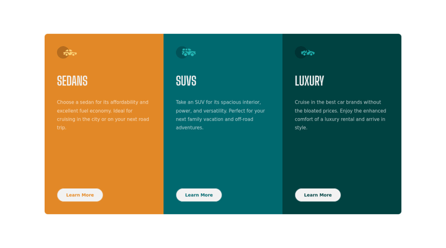
Design comparison
Solution retrospective
I want to learn how to design my @media queries better since I feel I could be doing something better but don't know what. There are a lot of copy + pasting and repetitive actions I perform, such as adjusting the height and width of elements for every @media query. From my experience, if you do the same thing multiple times, there is a better and faster way to do it. I'm wondering if that's the case here. Let me know your thoughts. Other than that, the HTML and CSS layout went pretty smooth as there were no complicated multi-layout designs. The problem came mainly from the uneven <button> alignment.
Community feedback
Please log in to post a comment
Log in with GitHubJoin our Discord community
Join thousands of Frontend Mentor community members taking the challenges, sharing resources, helping each other, and chatting about all things front-end!
Join our Discord
