Raymart Pamplona• 16,100
@pikapikamart
Posted
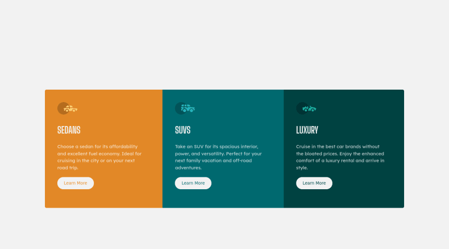
Hey, awesome work on this one. Layout right now in desktop is smaller however it is responsive which is great and the mobile layout looks great.
Some suggestions would be:
- Always have a
main
element to wrap the main content of your page. On this one, the.container
should be using themain
instead ofdiv
. - Also, since you are using flexbox, you don't need the
margin
on the.container
, you could have just set amax-width
on the.container
so that it's size will be contained properly. That way there won't be an extra scroll on desktop layout. - Always have a
main
element to wrap the main content of your page. On this one, the.container
should be using themain
instead ofdiv
and the.attribution
must usefooter
so that all content are inside landmark element. - Each car icons should be hidden since they are just decorative so use
alt=""
and extraaria-hidden="true"
attribute on theimg
tag. - A page must have a single
h1
on a page. Since there are no text-content that are visible that could beh1
, you will make theh1
screen-reader only text. Meaning this will be hidden for sighted users and only be visible for screen-reader users, search aboutsr-only
stylings and see how it is used. Theh1
text should describe what is the main content is all about, thish1
would be placed as the first text-content inside themain
element. Have a look at Grace's solution on this one see how she used theh1
and copy the stylings applied on it as well. - I would use
a
tag instead ofbutton
since it looks more like a link to "learn more" rather thanbutton
.
Aside from those, great work on this one.
2
Zain• 90
@ZainA11
Posted
@pikamart thank you so much for these useful tips!
0