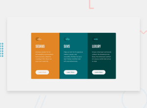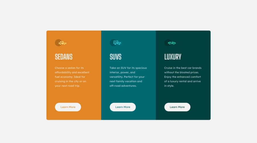
Design comparison
Community feedback
- @Islandstone89Posted 10 months ago
Hey, here is my feedback.
HTML:
-
There should only be one
<h1>on a page. Given there are 3 similar headings, I would change all of them into a<h2>. -
"Learn More" would navigate to another page, hence it is not a button but a link.
CSS:
-
Performance-wise, it's better to link fonts in the
<head>of the HTML then using@import. -
It's good practice to include a CSS Reset at the top.
-
bodyshould not have amin-width. -
font-sizemust never be in px. This is bad for accessibility, as it prevents the font size from scaling with the user's default setting in the browser. Use rem instead. -
line-heightmust also never be inpx. -
Paragraphs have a default value of
font-weight: 400, so there is no need to declare it. -
The individual cards should not have a fixed width. The only width you may need is a
max-widthin rem on the card container, so it doesn't get too wide on larger screens. -
It is best practice to do mobile styling first and use media queries (in rem instead of
px) for larger screens. The reason for this is because the mobile layout is usually less complex.
0 -
Please log in to post a comment
Log in with GitHubJoin our Discord community
Join thousands of Frontend Mentor community members taking the challenges, sharing resources, helping each other, and chatting about all things front-end!
Join our Discord
