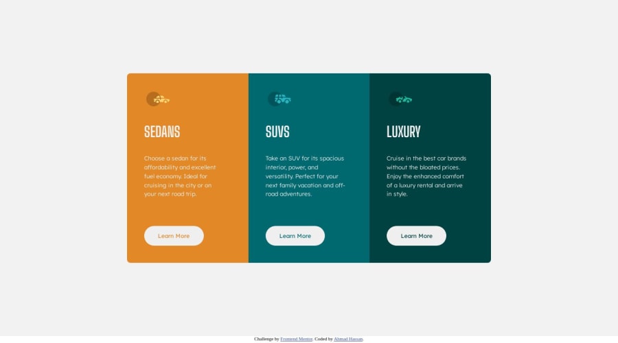
Design comparison
Solution retrospective
You can look at my code and If you have any type of feedback on how can I improve my code quality I'll be very happy to look at your feedback😊
Community feedback
- @JeuriMorelPosted about 1 year ago
One general tip is to add
cursor: pointer;to your buttons and/or links. It's a small change, but leads to better user experience.Also, don't just check what the site looks like on mobile and at full screen widths. Look at how it functions on medium sizes as well. Your solution's layout starts to break down in the 500px-900px range. The cards get all squished up and sometimes you even lose content, like the
button, because it gets so narrow.Marked as helpful2@Ahmadhassan0Posted about 1 year ago@JeuriMorel Thanks
Next time I'll keep in mind to add
cursor: pointer;and also I'll make it responsive for medium devices😊0 - @bccpadgePosted about 1 year ago
Hello @Ahmadhassan0. Congratulations on completing this challenge!!!🎉
When you complete Frontend Mentor projects, be sure to check the Accessibility report and HTML validation report for errors. Looking at those reports gives you great feedback on you are doing wrong and how to improve your solution. I don't want you to keep making the same mistakes over and over with each project you submit.
Here is an article about buttons vs. links and when to use them depending on the purpose.
Adding an
aria-labelon each link will explain the purpose as well.aria-label="learn more about sedan cars"
Hope you find this useful.
Marked as helpful1@Ahmadhassan0Posted about 1 year ago@bccpadge Thanks again
I'm not familiar with accessibility, but today I'll learn about it and will make every project with good accessibility🙂✔
And Sorry for stealing your screenshot section in readme file😅
0
Please log in to post a comment
Log in with GitHubJoin our Discord community
Join thousands of Frontend Mentor community members taking the challenges, sharing resources, helping each other, and chatting about all things front-end!
Join our Discord
