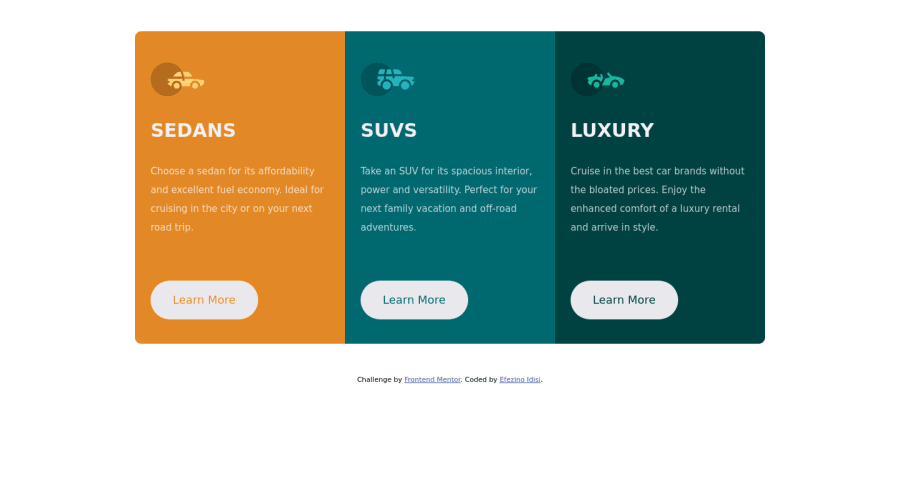
Design comparison
Solution retrospective
-I'm not confident about the responsiveness of the page and I would love to know how I can improve on using Media Queries.
Community feedback
- @PhoenixDev22Posted over 2 years ago
Hello Idisi Efezino,
Great Work! I have some suggestions regarding your solution:
HTML
-
To tackle the accessibility issue: You can add a
<h1>
withclass="sr-only"
(Hidden visually, but present for assistive tech). -
For any decorative images, each img tag should have empty
alt=""
andaria-hidden="true"
attributes to make all web assistive technologies such as screen reader ignore those images . In this challenge , all the images are decorative. -
Don't capitalise in html, let css text transform take care of that. Remember screen readers won't be able to Read capitalised text as they will often read them letter by letter thinking they are acronyms.
-
Imagine what would happen when the user click those
learn more
? Clicking those"learn more"
would trigger navigation not do an action so button elements would not be right. So you should use the<a>
.
And it is essential that interactive elements have
focus-visible
styles as well as hover styles. These need to be really clear and obvious as they are needed to help a keyboard user know where is focused on the page.CSS
-
border-radius
andoverflow hidden
to the main container that wraps the three cards so you don't have to set it to individual corners. -
height: 600px;
It's rarely ever a good practice to set heights on elements, you almost never want to set it . let the content define the height. -
In
line-height: 30px ;
use unitless value for theline-height
, this is the preferred way to set line-height and avoid unexpected results.Read more in MDN.
General point: Really important to keep css specificity as low/flat as possible. The best way to do styling purposes is single class selectors.(not
IDs
as IDs have a much higher specificity than classes) IDs have many uses in a webpage aside from being a CSS selector. For example as page anchors, fragment identifiers or to link labels to form fields.Overall, your solution is good. hopefully this feedback helps.
Marked as helpful0@efezinoidisiPosted over 2 years ago@PhoenixDev22 Yes, your feedback is really helpful. I did not know how to include the h1 tag because there was no header for the page. I understand better how to improve on Accessibility and styling with css . Thank you for your feedback.
0 -
Please log in to post a comment
Log in with GitHubJoin our Discord community
Join thousands of Frontend Mentor community members taking the challenges, sharing resources, helping each other, and chatting about all things front-end!
Join our Discord