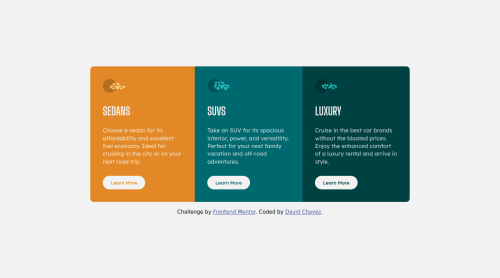
Submitted about 4 years agoA solution to the 3-column preview card component challenge
3 Column Preview Card Component
@codeDavidC

Solution retrospective
I'm not too sure what breakpoints I should use (since there are different sizes and orientations portrait/landscape).
What breakpoints do you recommend?
And How do I get the footer to stick to the bottom? I tried position absolute but it didn't work how I wanted.
Code
Loading...
Please log in to post a comment
Log in with GitHubCommunity feedback
No feedback yet. Be the first to give feedback on David Chavez's solution.
Join our Discord community
Join thousands of Frontend Mentor community members taking the challenges, sharing resources, helping each other, and chatting about all things front-end!
Join our Discord