Not Found
Not Found
Not Found
Not Found
Not Found
Not Found
Not Found
Not Found
Not Found
Not Found
Not Found
Not Found
Not Found
Not Found
Not Found
Not Found
Not Found
Not Found
Not Found
Not Found

Submitted

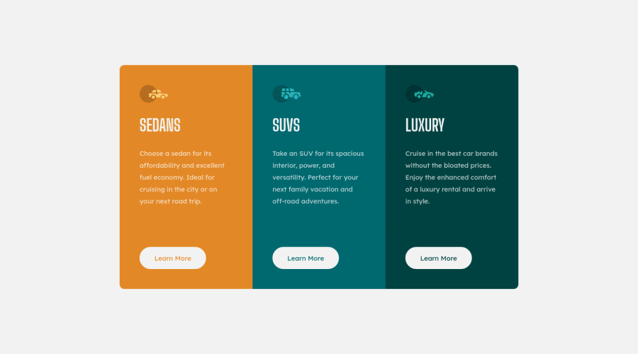
3 column preview card component

@VittorioDL

Desktop design screenshot for the 3-column preview card component coding challenge

This is a solution for...

  • HTML
  • CSS
1newbie
View challenge

Design comparison


SolutionDesign

Solution retrospective


I appreciate any suggestion to improve my code! Feel free to tell me what I could have done better. The hardest part was to center the card__container and avoid the overflow. In fact i created a media query at a relatively big screen size to avoid the card to go out of screen. When i resize the window the buttons are not in line with each other and i haven't been able to fix it. When the screen gets smaller than 350px the card starts to disappear. How can i fix it? Thank you

Community feedback

Lucas 👾 104,420

@correlucas

Posted

👾 Ciao Vittorio, congratulations for your new solution!

Overall your solution seems fine, I like that's responsive too.

There's only one detail you can improve, to keep it super responsive. Note that after 240px, the container doesn't keep all the information inside it because there's padding holding the container, but not the text, so the text and button pop out the container. You can fix it adding a smaller padding with a media query. Example below:

@media (max-width: 260px) { .card { padding: 1.5rem; }}

Try your solution with devtools and pay attention to the mobile version, then you'll see the content break after 240px.

Hope it helps, congrats! Happy coding.

Marked as helpful

0

@VittorioDL

Posted

@correlucas Thank you so much for the feedback, I really appreciate that and it helps me to get better. Just one more question: below 240px the content still gets out of container. Is it possible to make it responsive even at this small width or is it unnecessary?

0
Lucas 👾 104,420

@correlucas

Posted

@VittorioDL I get why this is happening, you've this unnecessary property overflow: hidden; instead of that, apply border radius to each card (note that the center card doesn't need rounded borders)

.card__container {
    display: grid;
    grid-template-columns: 1fr 1fr 1fr;
    grid-template-rows: 1fr;
    max-width: 900px;
    margin: 5rem 2rem;
    border-radius: 0.7rem;
    /* overflow: hidden; */
}

Marked as helpful

0

Please log in to post a comment

Log in with GitHub
Discord logo

Join our Discord community

Join thousands of Frontend Mentor community members taking the challenges, sharing resources, helping each other, and chatting about all things front-end!

Join our Discord