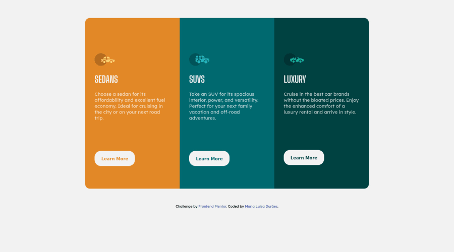
Design comparison
Solution retrospective
That was probably the easiest challenge I've ever done so far. I was able to evolve better and did this challenge much faster than the other challenges I completed earlier. Any tip on how I can improve is very welcome
Community feedback
- @PhoenixDev22Posted about 2 years ago
Hi Maria Luisa Durães,
Congratulation on completing another frontend mentor challenge. I see you have received some incredible feedback, if you don't mind me reiterating some:
- About
<h1>
it is recommended not to have more than one h1 on the page. Multiple<h1>
tags make using screen readers more difficult, decreasing your site’s accessibility. Then swap those<h1>
by<h2>
.
- Images must have alt attribute. In this challenge, the images are much likely to be decorative. For any decorative images, each img tag should have empty
alt=""
andaria-hidden="true"
attributes to make all web assistive technologies such as screen reader ignore those images.
- What would happen when the user click those learn more? In my opinion, clicking those "learn more" would likely trigger navigation not do an action so button elements would not be right. So you should use the
<a>
. For future use , it's a good habit of specifying the type of the button to avoid any unpredictable bugs.
- Adding
rel="noopener"
orrel="noreferrer"
totarget="_blank"
links. When you link to a page on another site using target=”_blank” attribute , you can expose your site to performance and security issues.
- Don't capitalize in html, let css text transform take care of that. Remember screen readers won't be able to Read capitalized text as they will often read them letter by letter thinking they are acronyms.
- Add
border-radius
andoverflow hidden
to the main container that wraps the three cards so you don't have to set it to individual corners.
- As @Enmanuel-Otero-Montano mentioned, there are so many repeated style rules , better to use reusable and manageable classes. For example: each column have the same styles(rules like padding ), So you can use a class
.card
for the shared styles, then for each distinct styles like (background color) use another class. card__sedans, . card__suvs. card__luxury
.
Hopefully this feedback helps. Happy coding!
Marked as helpful2@Enmanuel-Otero-MontanoPosted about 2 years ago@PhoenixDev22 Hello
Thank you for supporting my comment and thus being able to help the colleague.
I would also like to take this opportunity to tell you that you are absolutely right when you commented in my solution to this challenge that the images are decorative and I replied that it was for appreciation (I don't know if you remember), but then I kept thinking about that and my conclusion was that they really are decorative.
I don't know if you understand what I said, since I use Google translate, my English is still not good enough.
A big hello to you, genius.
0@PhoenixDev22Posted about 2 years ago@Enmanuel-Otero-Montano Hi Enmanuel Otero,
Of course I still remember, But I still think that are decorative they don't add meaning to the content they likely be included to make the website more visually attractive. If they are removed, it doesn't affect anything.
Here's @grace-snow solution for the same challenge who is an accessibility expert.
If you find it difficult to decide if an image is decorative vs. instructive, read your page or article out loud to another person. If they can understand what you are saying without describing the images, then you can feel assured they are decorative.
Great work for providing the frontend mentor community with helpful feedback. And I'm just a learner like everybody here.
Thanks and Happy coding!
1 - About
- @Enmanuel-Otero-MontanoPosted about 2 years ago
Hello Maria Luisa!
Congratulations on completing the challenge.
Allow me some suggestions that can help you better.
First, I suggest you make the font request from the HTML inside the head tag and not from the CSS, to improve page load time. I'll leave you below how you can do it.
Second, it is not necessary to put a p tag inside the button to put text, you can do it directly on the button. If you look at the Frontendmentor bug report, it marks that detail as wrong.
Third, you must provide an alt attribute to the img tag and in this case leave it empty, since images are decorative, although ideally you should insert the images from CSS since they are merely decorative.
Lastly, you could have changed or used an article tag where you used the div with the car markup class, just to have a more semantic HTML. You could also have put a single class for these containers, apart from the one it has and have applied the height, width and padding properties with that class, since if you pay attention you have them repeated in the CSS, you could reach the same previous result, without apply a common class, but grouping the 3 classes (suvs, luxury and sedans) and apply the properties that are repeated. With either of the two previous variants you would not have repeated CSS.
The latter is a small detail that is not noticed in these small challenges, but in large projects it can affect performance.
<link rel="preconnect" href="https://fonts.googleapis.com"> <link rel="preconnect" href="https://fonts.gstatic.com" crossorigin> <link href="https://fonts.googleapis.com/css2?family=Big+Shoulders+Display:wght@700&family=Lexend+Deca&display=swap" rel="stylesheet">
<button class="button_luxury">Learn More</button>
Cheers!
Marked as helpful2 - @correlucasPosted about 2 years ago
👾Hello Luisa, congratulations for your new solution!
You did a really good work building this solution and putting everything together. Here's some tips for you to improve it even more:
Give the component the proper vertical alignment with
min-heigh: 100vh
for the body height size andflexbox
for the alignment, see the code changes below:body { min-height: 100vh; background-color: hsl(0, 0%, 95%); font-size: 15px; font-family: 'Lexend Deca', sans-serif; color: hsla(0, 0%, 100%, 0.75); font-weight: 400; display: flex; align-items: center; justify-content: center; flex-direction: column; }
Replace the divs you've used to wrap the cards and place
<article>
for a better semantic. Remember to use ever meaningful tags for big blocks of elements.👋 I hope this helps you and happy coding!
Marked as helpful0
Please log in to post a comment
Log in with GitHubJoin our Discord community
Join thousands of Frontend Mentor community members taking the challenges, sharing resources, helping each other, and chatting about all things front-end!
Join our Discord