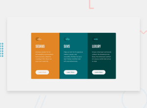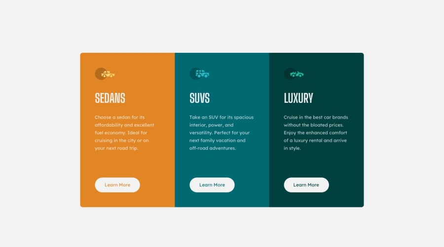
Design comparison
Solution retrospective
Hey everyone! Another project in the books! Can I get some feedback please if you have the time! I would really appreciate it! This project was fun for a starter project. This project really allowed me to see how to utilize classes and modifying.
Community feedback
- @pikapikamartPosted about 3 years ago
Hey, awesome work on this one and congrats on your second challenge in here! Desktop layout looks nice, site is responsive, but your mobile breakpoint is too soon. Right now, you are showing the mobile state from 0px-1200px which is too big for mobile state to only occupy. Desktop layout could have used more of those screen-time. Though mobile state looks fine.
Some other suggestions would be:
- Using that grey background-color would be great so that it matches the design.
- On this one, It would be great to have this markup:
<main /> # main content
<footer /> # contains the attribution
This way, all content of your page will be inside their own respective landmark element.
- Using
marginto center a layout works fine but not enough if it involves y-axis. Try zooming out, you will see that the layout is not being centered properly. Another approach would be something like this, but first remove all themarginin the.container rowselector and in thebodytag add these stylings:
align-items: center;
display: flex;
flex-direction: column;
justify-content: center;
min-height: 100vh;
This way, it will make sure that the layout will stay centered.
- You don't need to apply the orange
background-colorin the.container rowselector so removing that would be great. Then to make those card items have a properborder-radiuswhat you can do is that:
- On the first card, use `border-radius: .5rem 0 0 .5rem.
- On the second card don't use `border-radius:
- On the third, use
border-radius: 0 .5rem .5rem 0
border-radiuscan accept 8 values, but we are just going to use 4 in here since you don't need those extra. Each of the 4 items signifies,top-left,top-right,bottom-leftandbottom-right.- Those car-icons are only decorative images. Decorative images should be hidden for screen-reader at all times by using
alt=""andaria-hidden="true"to theimgtag or onlyaria-hidden="true"if the image is usingsvg. - Only use descriptive
alton images that are meaningful and adds content to the site otherwise hide the image for screen-reader users. - Those car titles on the other should be using a heading tag since they give information on what each section would contain. Use
h2for each of them. - As you may know, a page needs to have a single
h1. Since there are not visible text that are suitable to beh1, theh1would be a screen-reader only heading. Meaning it will be hidden visually but present for screen-reader users. On this, theh1would have likesr-onlyclass and the text-content should describe what is the main-content is all about. Theh1could be placed as the first text inside themain. Have a look at this solution of Grace in this same challenge inspect the layout and see the usage ofh1as well the stylings applied to it. - Lastly, just lowering the breakpoints :>
Aside from those, great job again on this one.
1@ltc870Posted about 3 years ago@martpika yooo thanks so much for the feedback! I really appreciate you taking the time and giving me some good advice. I'm shocked at how much you put into this, I honestly didn't expect this but I really, really appreciate you doing this! I'll apply all of the suggestions you made. Thank you so much!
1
Please log in to post a comment
Log in with GitHubJoin our Discord community
Join thousands of Frontend Mentor community members taking the challenges, sharing resources, helping each other, and chatting about all things front-end!
Join our Discord
