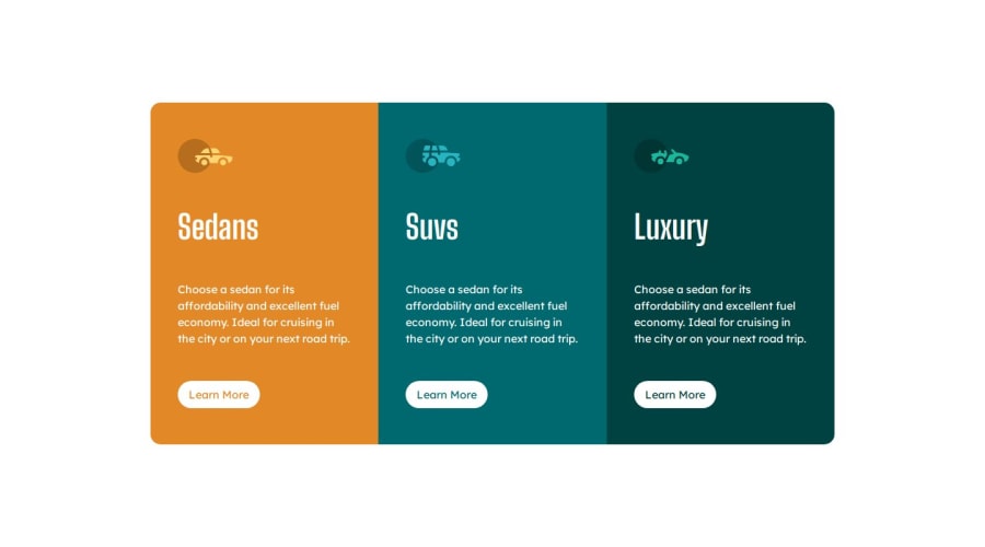
Design comparison
SolutionDesign
Community feedback
- @0xabdulkhaliqPosted about 1 year ago
Hello there 👋. Congratulations on successfully completing the challenge! 🎉
- I have a suggestion regarding your code that I believe will be of great interest to you.
WRONG USAGE OF ARTICLE ELEMENT :
- Using
articleelements as buttons is not appreciated, in this case we want to usebuttonelement only. Both serves different purposes and use cases.
- You need to change
articleelements intobuttonelements to make your solution accessible, and additionally we need to style those buttons when hovering.
- So add these css rules (I hope you converted
articletobuttonelements)
button {
    background: transparent;
    color: white;
    border: 1px solid white;
}
.
I hope you find this helpful 😄 Above all, the solution you submitted is great !
Happy coding!
Marked as helpful0
Please log in to post a comment
Log in with GitHubJoin our Discord community
Join thousands of Frontend Mentor community members taking the challenges, sharing resources, helping each other, and chatting about all things front-end!
Join our Discord
