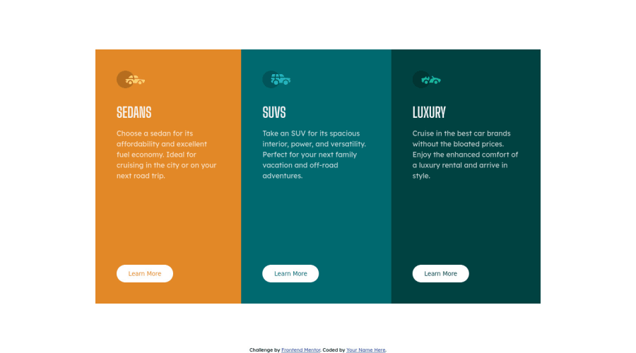
3 column preview card component
Design comparison
Solution retrospective
Is my code understandable?
Did I use the semantic HTML tags correctly, should I add more or less?
In what areas of my code can I improve on?
All feedback is greatly appreciate. It helps me to improve as a frontend developer. Thanks!
Community feedback
- @KarenMascarenhasLourencoPosted almost 2 years ago
Thank you for your help. I have a question, in this case where should I put the H1 tag? I don't see a hierarchy in the titles.
0 - @HassiaiPosted almost 2 years ago
The html must have <h1> to fix the accessibility issues.
There is no need to give the section a min-height value. Replace the min-height in the section with a padding value for all the sides, this will prevent the content from overflowing on smaller screens and its a responsive replacement.
Give the main a fixed max-width value for a responsive content instead of a percentage width. Give the body a background-color of hsl(0, 0, 0, 95%).
You forgot to add a border-radius to the design.
Hope am helpful.
Well done for completing this challenge. HAPPY CODING
0
Please log in to post a comment
Log in with GitHubJoin our Discord community
Join thousands of Frontend Mentor community members taking the challenges, sharing resources, helping each other, and chatting about all things front-end!
Join our Discord
